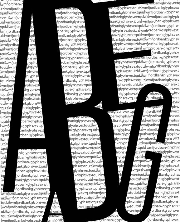
I think the top has more potential with a tighter crop to activate the interior spaces.
I do like the linking B& C but the top and bottom feel unrelated. Perhaps use the ABC area as the full composition and insert the other letters at a smaller scale or a background screen pattern.

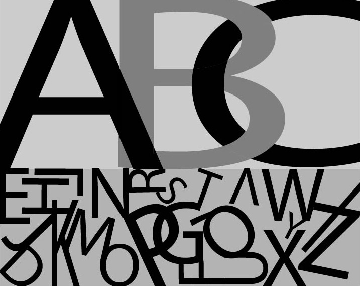
I like the bottom one a lot. Funny narrative with giving ABC all of the attention and then squashing the other letters.
I think the top has more potential with a tighter crop to activate the interior spaces.
I do like the linking B& C but the top and bottom feel unrelated. Perhaps use the ABC area as the full composition and insert the other letters at a smaller scale or a background screen pattern.