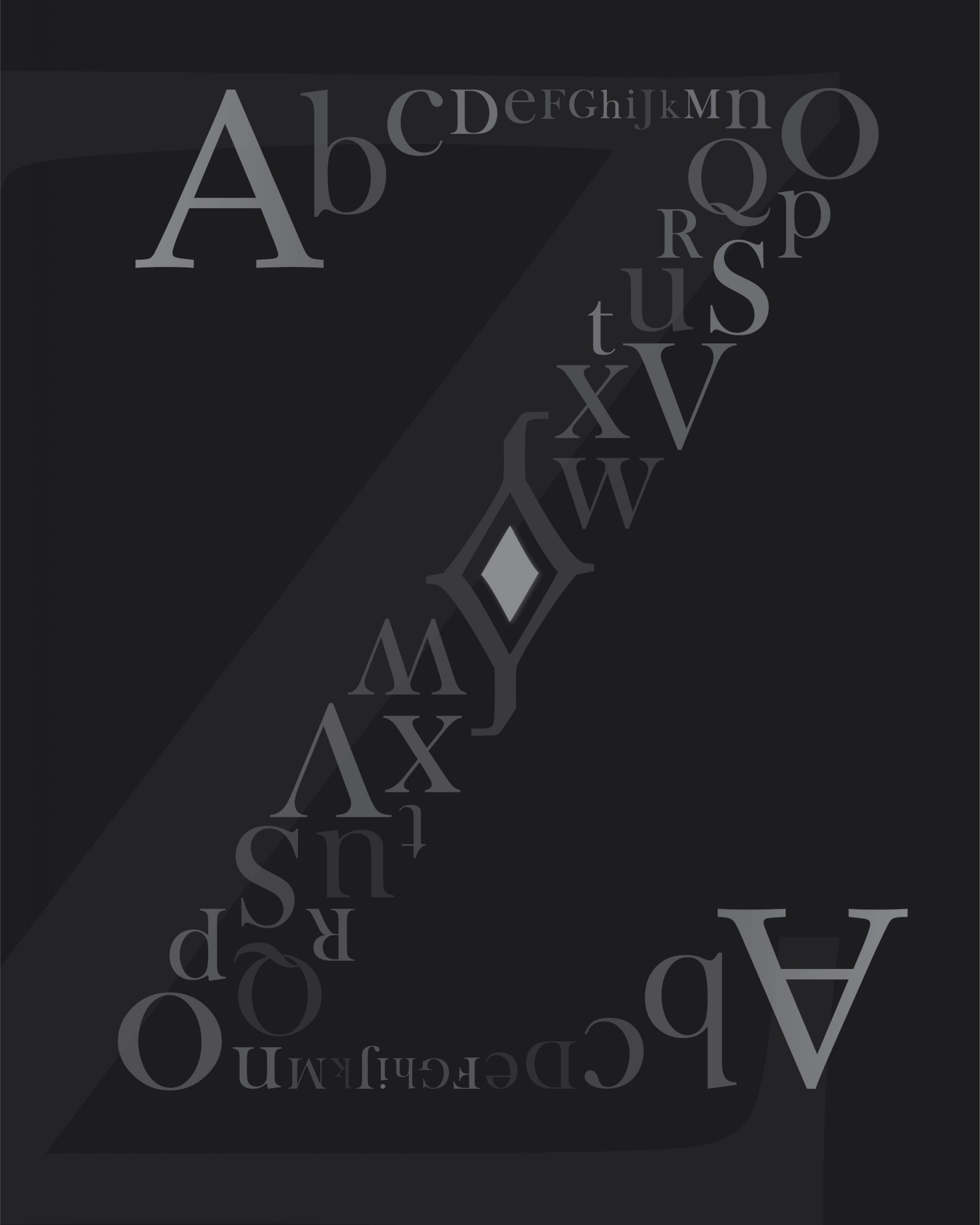
Like the fill design in the Z. The A elements would be better served with a darker value.
I like the concept of a larger element subdividing the background, but a larger Z would make more sense graphically than the A.
Composition would likely be fine without it.


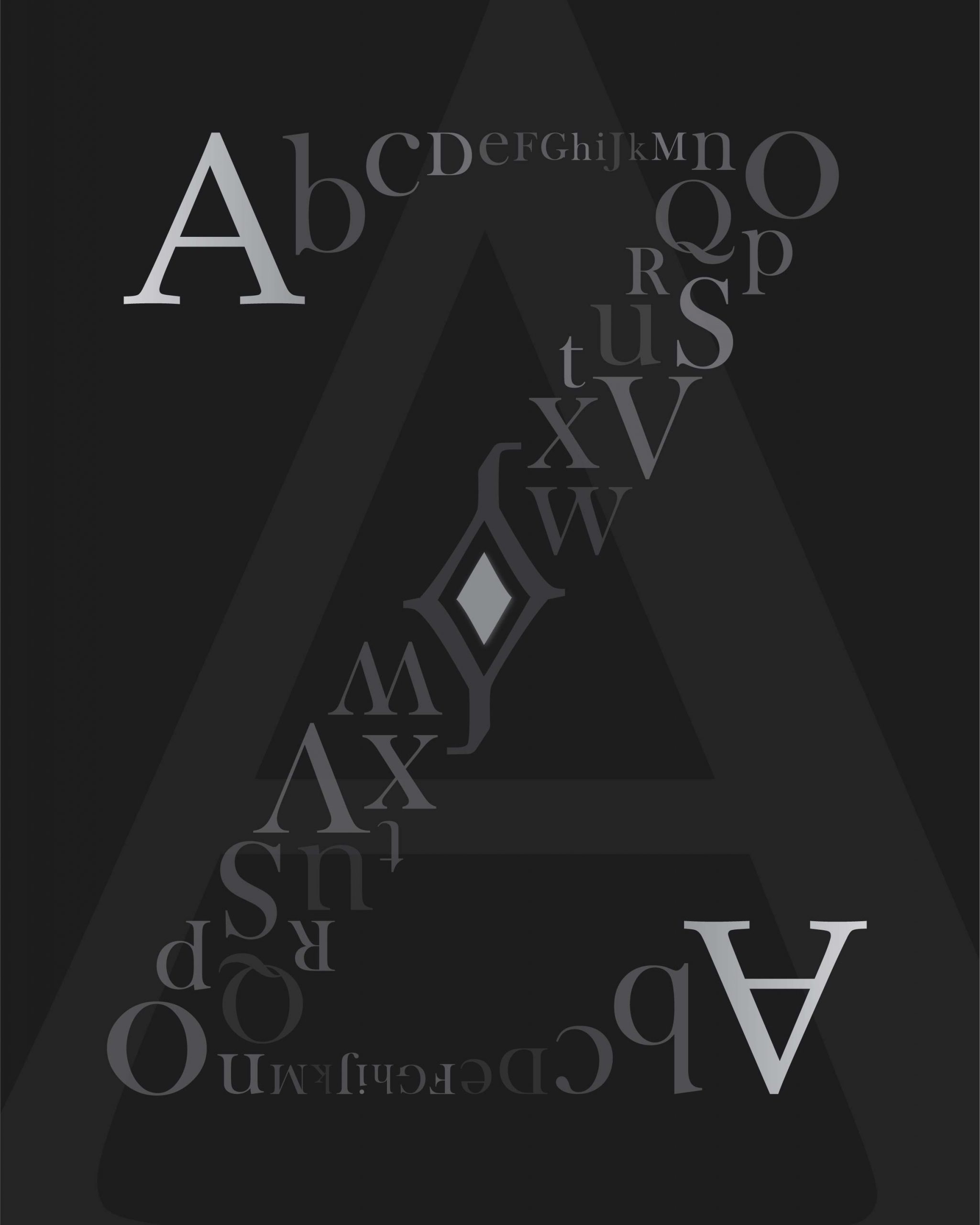
Like the fill design in the Z. The A elements would be better served with a darker value.
I like the concept of a larger element subdividing the background, but a larger Z would make more sense graphically than the A.
Composition would likely be fine without it.