All a bit muddy, so up the contrast. #1 has some interesting sci-fi potential. I like the hovering rectangle of dots. #2 has a good compositional foundation, but rethink the type integration to be more subtle. Log in to Reply

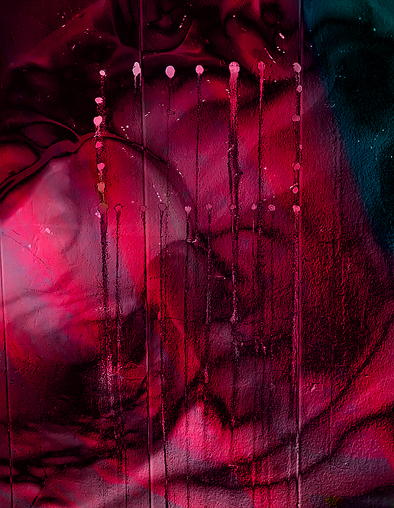
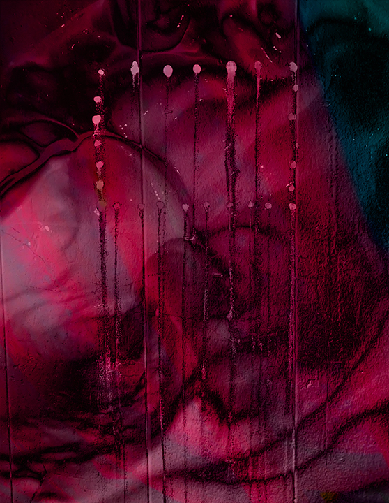


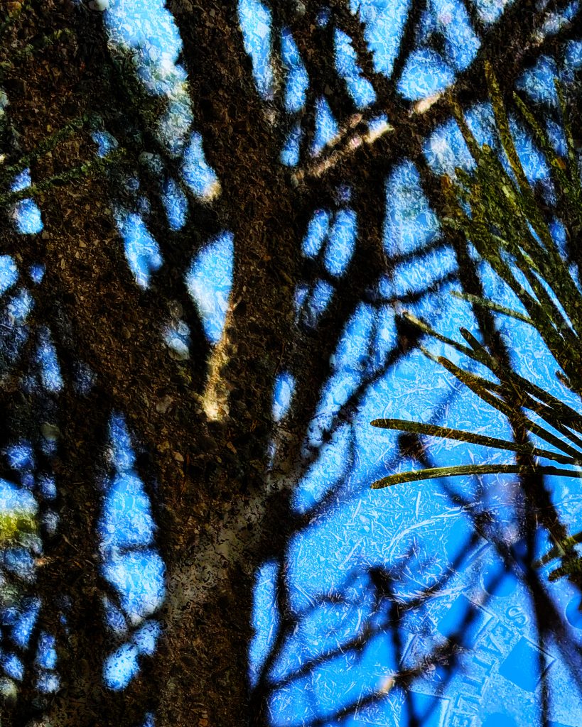
All a bit muddy, so up the contrast.
#1 has some interesting sci-fi potential. I like the hovering rectangle of dots.
#2 has a good compositional foundation, but rethink the type integration to be more subtle.