Sorry I missed these.
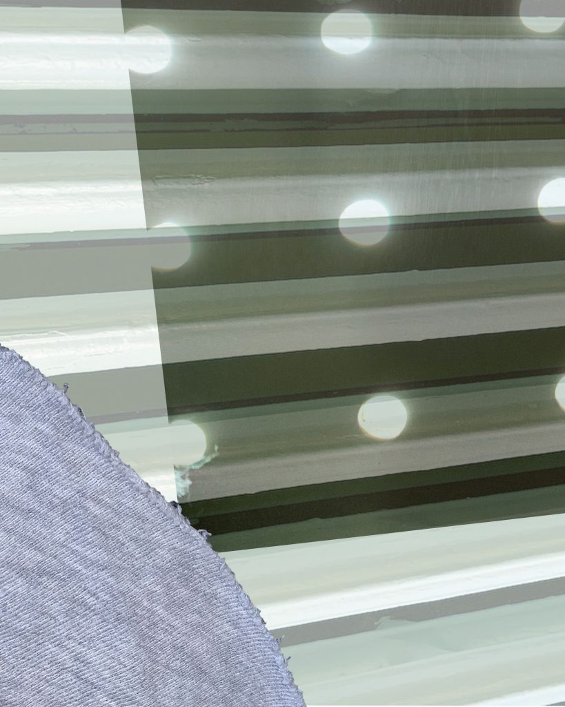
The first image has the most special presence, but the the texture in the lower left feels a bit oof-key.
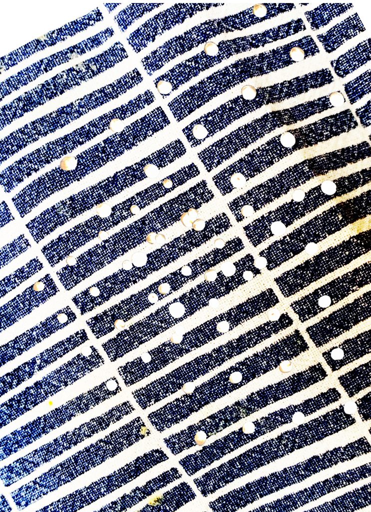
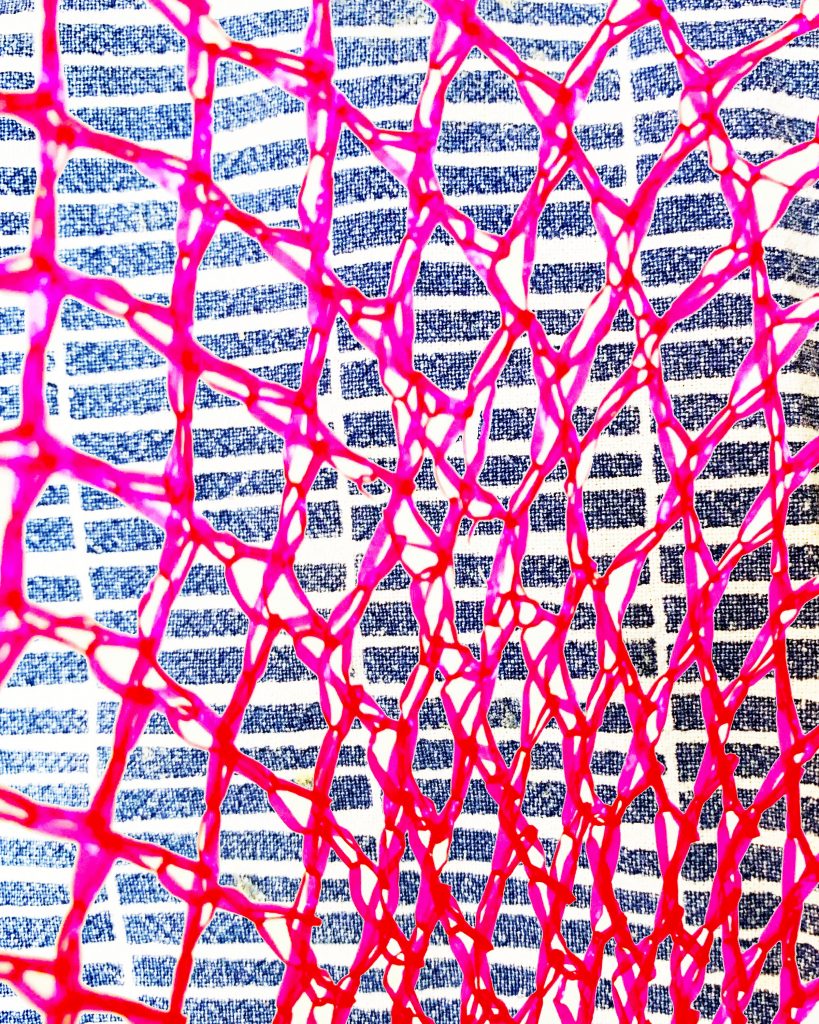
The other two are a bit repetitive, but feature good color and contrast. The middle one seems to have most potential, just make sure to integrate the typographic element.

Sorry I missed these.
The first image has the most special presence, but the the texture in the lower left feels a bit oof-key.
The other two are a bit repetitive, but feature good color and contrast. The middle one seems to have most potential, just make sure to integrate the typographic element.