Some new color options here. I wanted my designs to work better together so I decided to incorporate the rings/circles for all 4.. But maybe it isn’t necessary? Also, these are just screenshots, but the color on here seems less vibrant than in illustrator. Maybe I’ve just been staring at the colors too long.
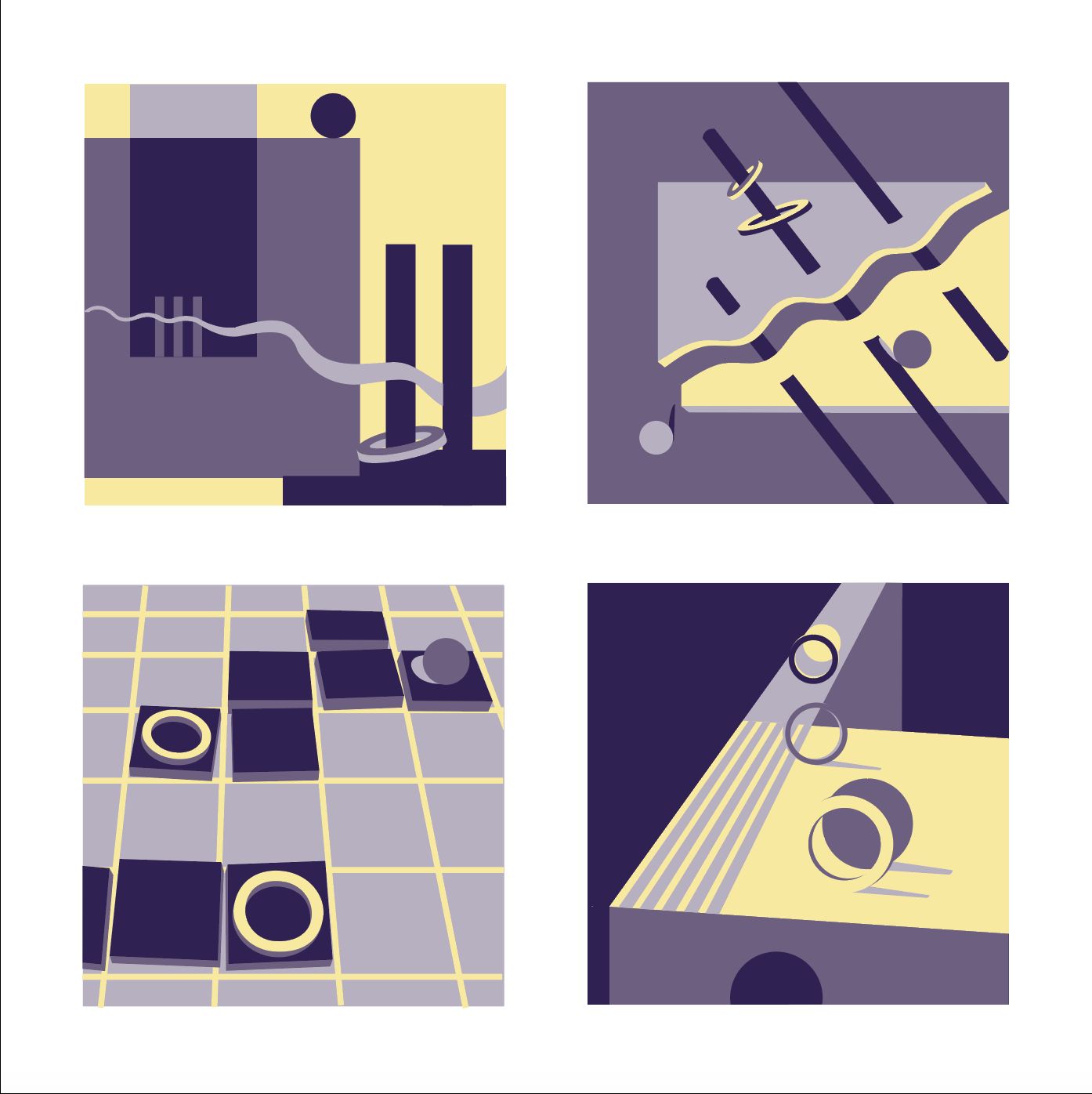

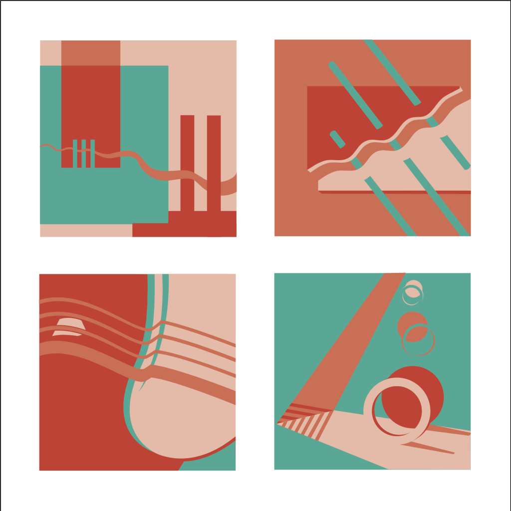
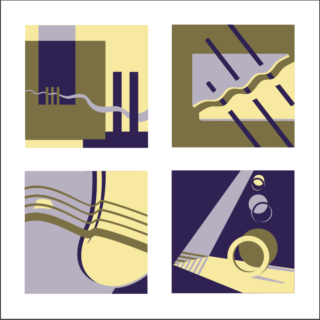
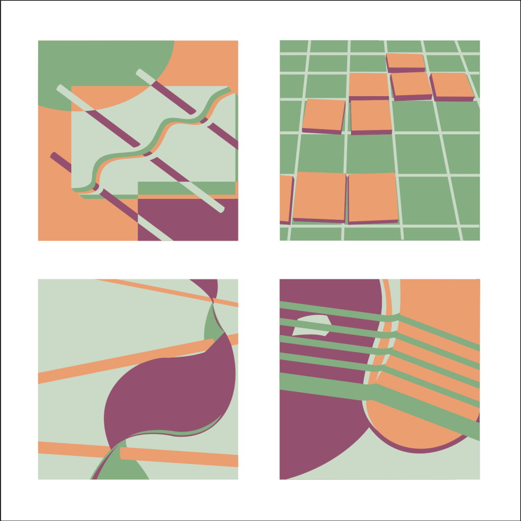
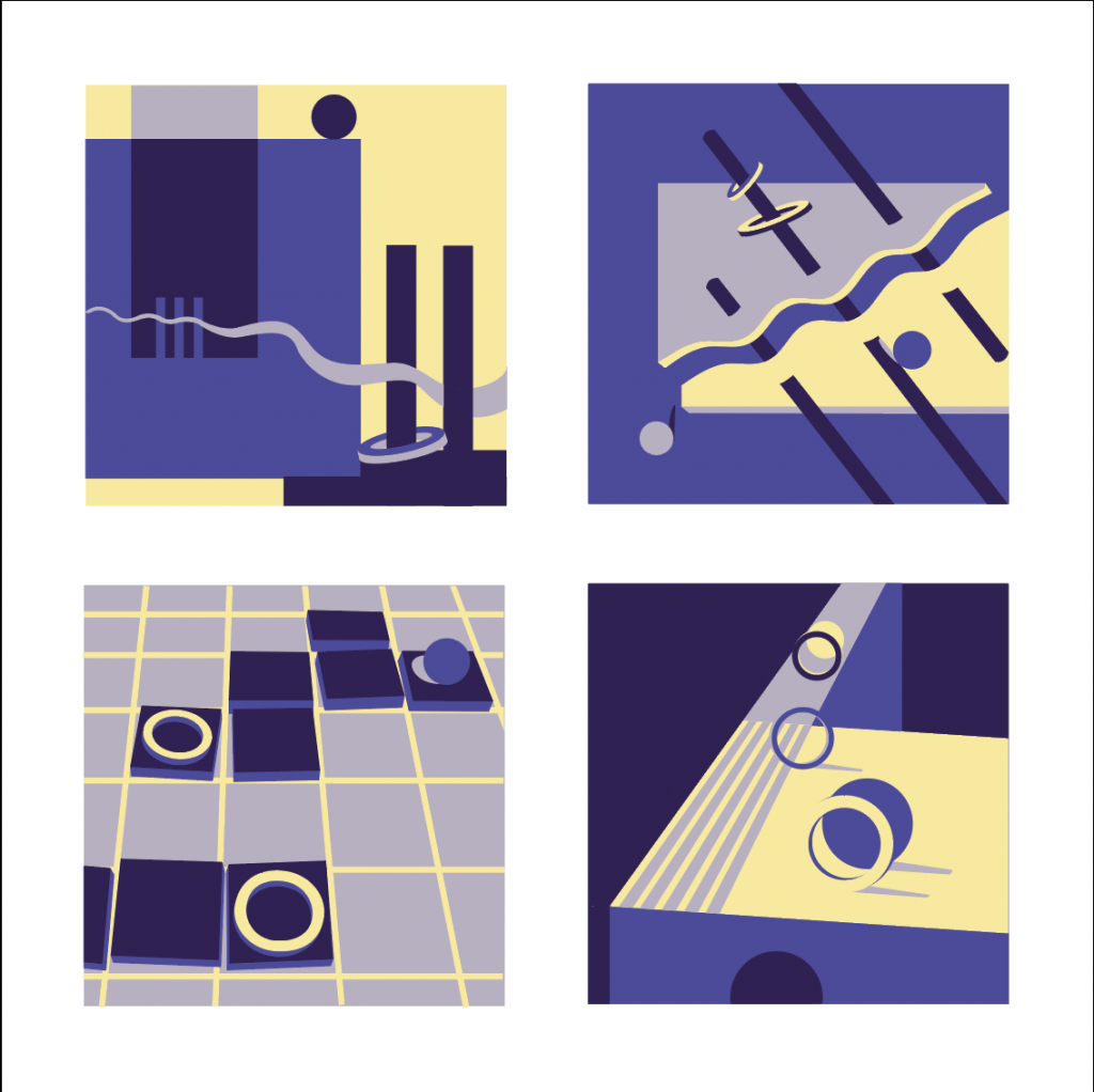

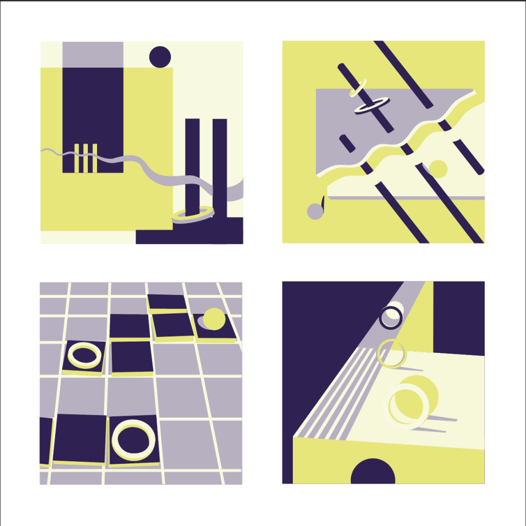
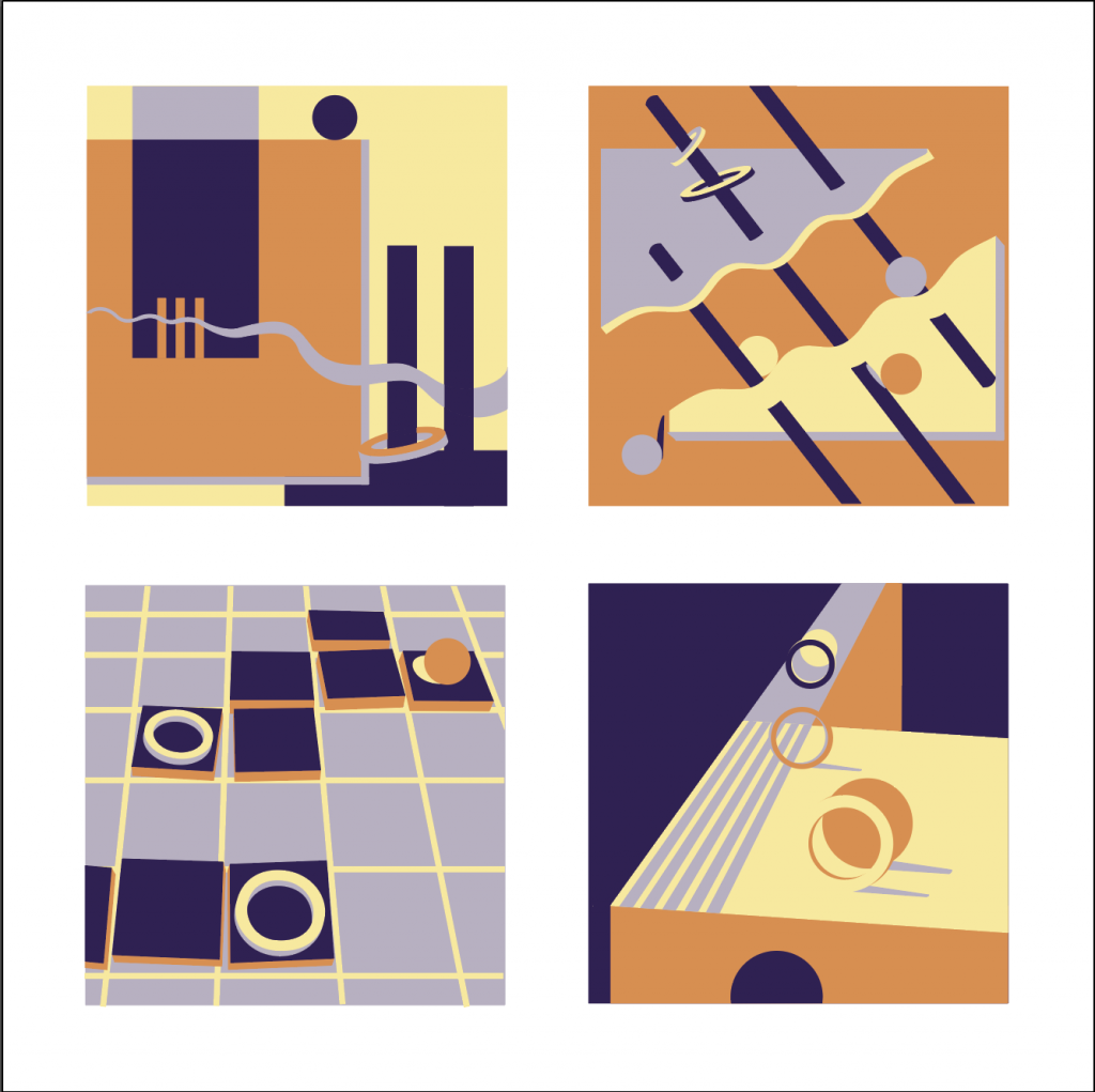
Some intriguing design elements in these. The contrast is best in the blue/yellow palette but that earthy green isn’t working.
Love the grid/tile design in the last group, but the other designs in the series aren’t as strong.
The palette looks good. Maybe just a bit too much going on. I would consider losing all of the circles in these designs and keeping the hollow rings, which are more effective.