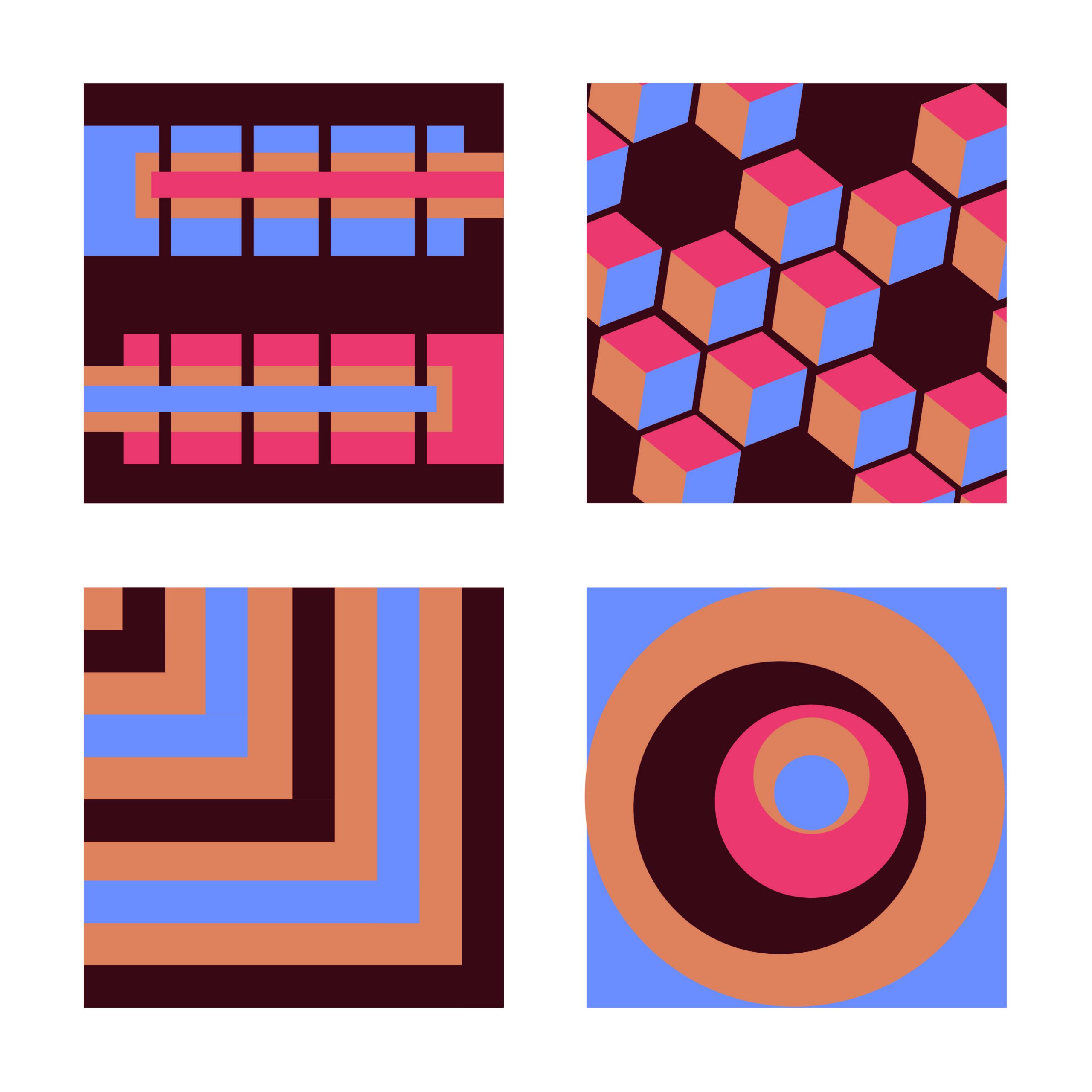
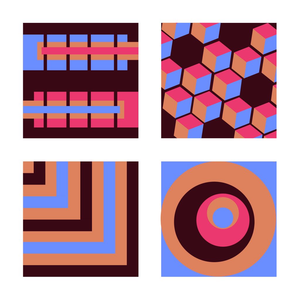
Thanks for all the options! The series with the amped up pink in blue has a pretty aggressive palette the makes for a lot of visual activity but the top two designs seem to embrace it and create interest a la op-art.
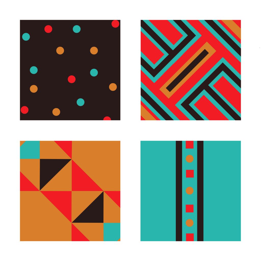
The next series has similar issues with the red, and again works best in the top two of the series.
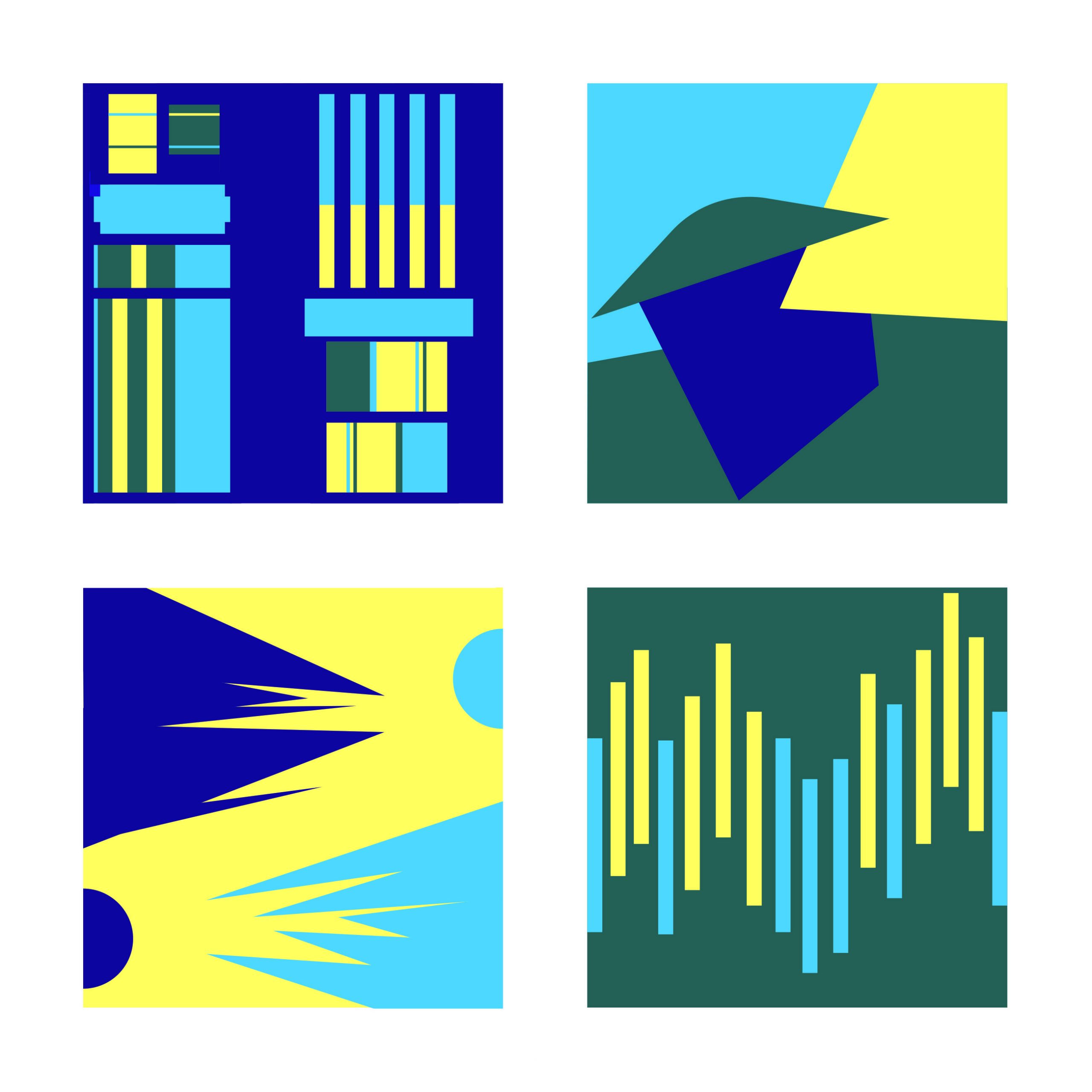
The ultramraine blue just isn’t working in the last series, so try backing off the saturation
The colors I had on illustrator are way more toned down. The purple was more of a periwinkle. In the second one the red and teal are less saturated. Same goes for the blue that was more of a dark violet and the blue was supposed to be a deeper sky blue.
What do I do about the colors changing once they are on this platform?
I am the most interested in your top two sets. I think the first set has most successful patterns because they all invoke movement. The second set (my favorite color scheme you have) is a good start. The tribal patterns you’ve created are nice and bold but I think the top left corner and bottom right corner need some more attention and maybe lose the polka dots and stick more to geometric shapes.

Thanks for all the options! The series with the amped up pink in blue has a pretty aggressive palette the makes for a lot of visual activity but the top two designs seem to embrace it and create interest a la op-art.
The next series has similar issues with the red, and again works best in the top two of the series.
The ultramraine blue just isn’t working in the last series, so try backing off the saturation
The colors I had on illustrator are way more toned down. The purple was more of a periwinkle. In the second one the red and teal are less saturated. Same goes for the blue that was more of a dark violet and the blue was supposed to be a deeper sky blue.
What do I do about the colors changing once they are on this platform?
Try taking a screenshot (shift-command-4) to see if they are more accurate. Or send me an email with the AI file.
I am the most interested in your top two sets. I think the first set has most successful patterns because they all invoke movement. The second set (my favorite color scheme you have) is a good start. The tribal patterns you’ve created are nice and bold but I think the top left corner and bottom right corner need some more attention and maybe lose the polka dots and stick more to geometric shapes.