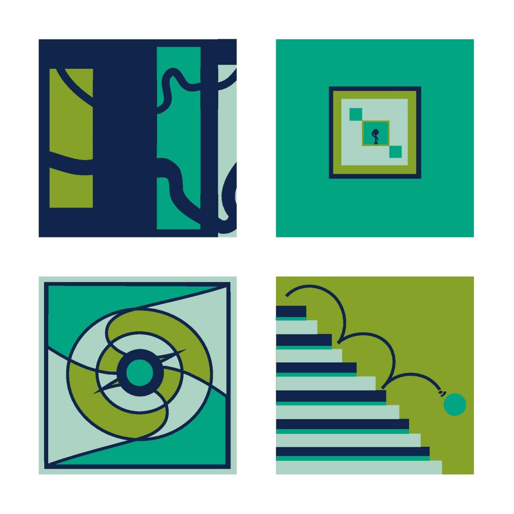
2nd attempt – took my 1st attempt and changed the orange to a less intense lighter green that doesn’t overpower the light mint color. I also changed up the upper right and lower left designs. Am I on the right track with this? Let me know!
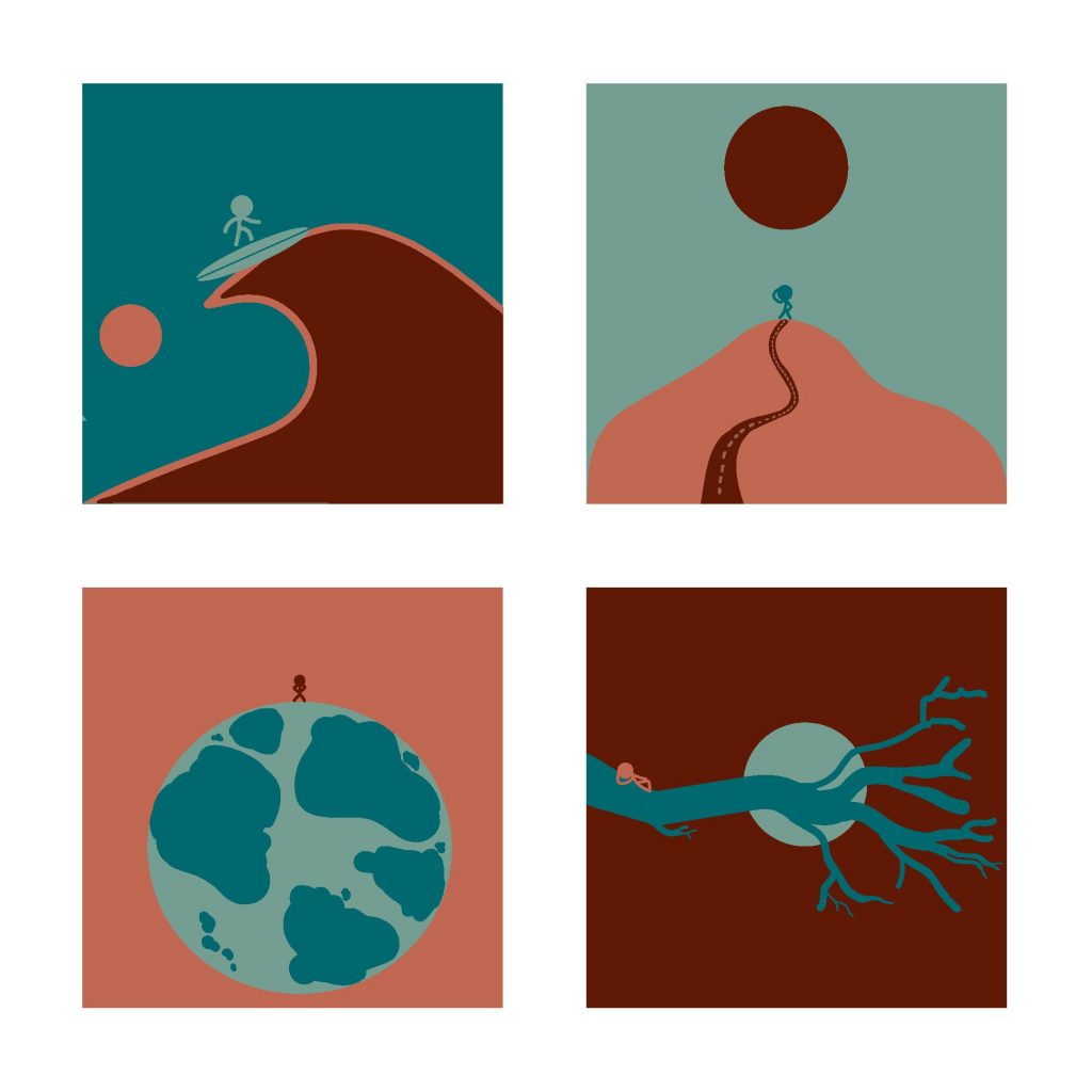
3rd attempt – decided to play around with some new colors and entirely new designs. The stick figure (first seen in my 2nd attempt) is the star of the show. Which attempt do you like the best?
4 thoughts on “Michelle’s Color Trials”
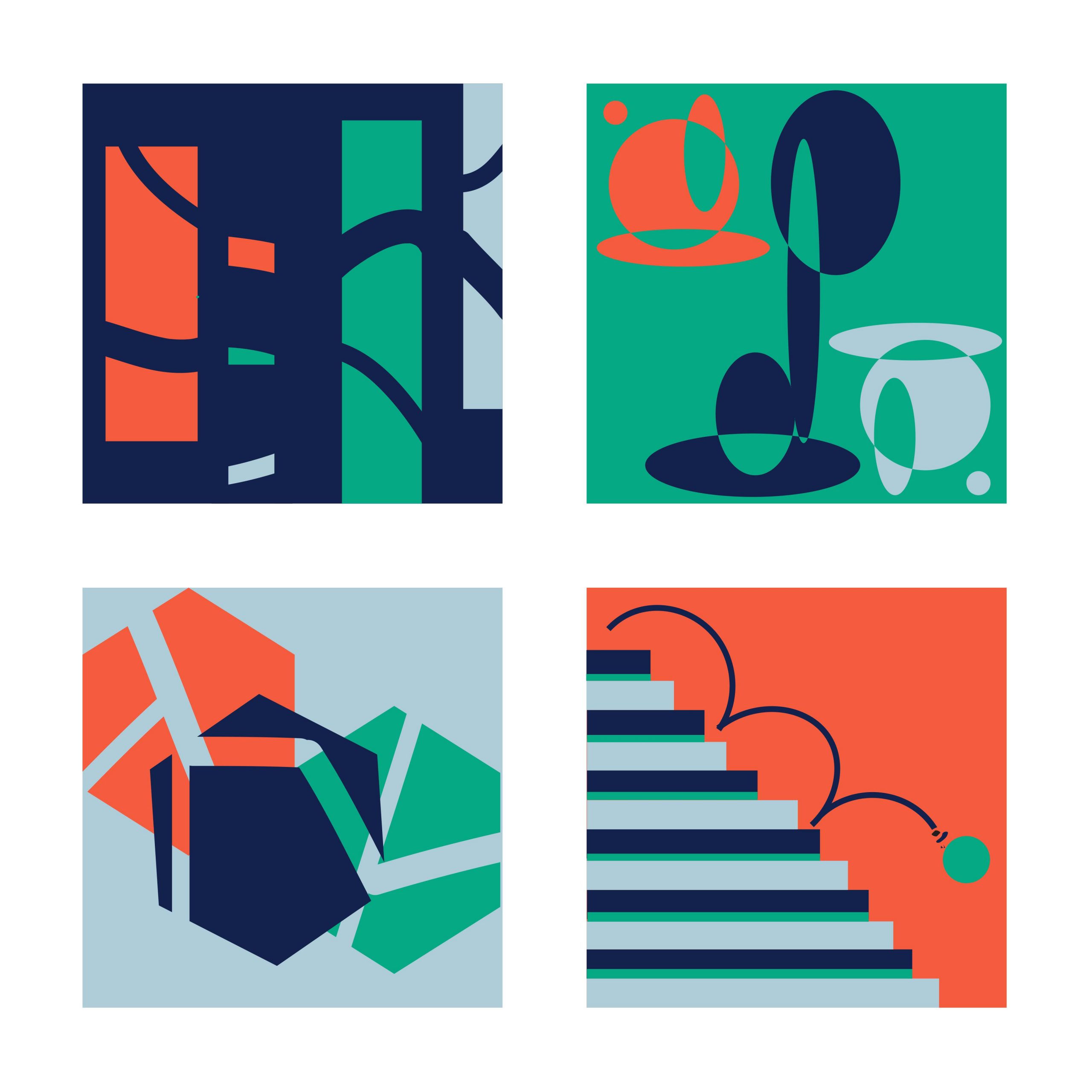
The orange is bit lively (particularly when in contact with the green) and overwhelms the composition in the upper right and lower left. Those two aren’t as conceptually as strong as the others.
Upper left is most intriguing but the three smaller pieces could make more sense formally.
These all seem like they need the addition of a very light color to create some contrast.
I like the narrative quality of the “little man” series, but the palette needs work. Take a look at Jack’s pieces to see how he embraced the weirdness with his palette.
I would just try the designs with a few alternate palettes.
I am definitely drawn to the “little man” series the most but agree there needs to be more contrast in the colors. I think you should think more about his scale though. Either make the guys all the same or make the sizes more drastically different to enhance each scene’s scale.


The orange is bit lively (particularly when in contact with the green) and overwhelms the composition in the upper right and lower left. Those two aren’t as conceptually as strong as the others.
Upper left is most intriguing but the three smaller pieces could make more sense formally.
Hi, thanks for the feedback, Jason! I added some new color trials and tried to fix some of what you mentioned – what do you think?
These all seem like they need the addition of a very light color to create some contrast.
I like the narrative quality of the “little man” series, but the palette needs work. Take a look at Jack’s pieces to see how he embraced the weirdness with his palette.
I would just try the designs with a few alternate palettes.
I am definitely drawn to the “little man” series the most but agree there needs to be more contrast in the colors. I think you should think more about his scale though. Either make the guys all the same or make the sizes more drastically different to enhance each scene’s scale.