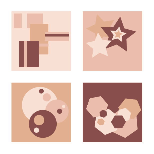
A good approach but these are in need of a little better compositional arrangement.
You also need more contrast between thew middle values in these. Try accenting or nesting the middle value shapes with light or dark colors (like you did in the star)

A good approach but these are in need of a little better compositional arrangement.
You also need more contrast between thew middle values in these. Try accenting or nesting the middle value shapes with light or dark colors (like you did in the star)