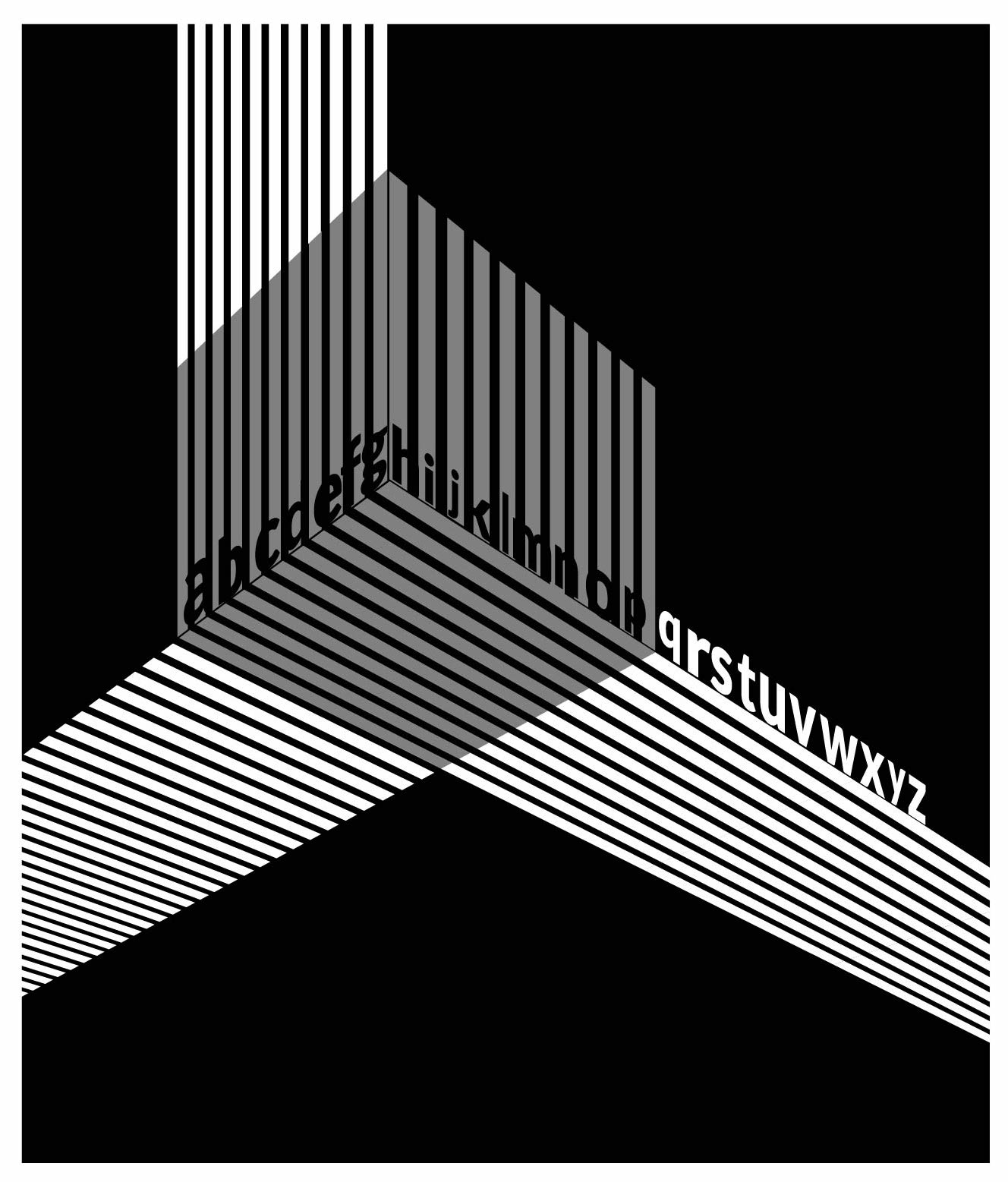
Like the compositional subdivision and space, but the type in the central form competes with all the busy verticals around it.
Perhaps the remainder of the letters would work better along the edge of the form to be more consistent with what you did on the right side.


Like the compositional subdivision and space, but the type in the central form competes with all the busy verticals around it.
Perhaps the remainder of the letters would work better along the edge of the form to be more consistent with what you did on the right side.