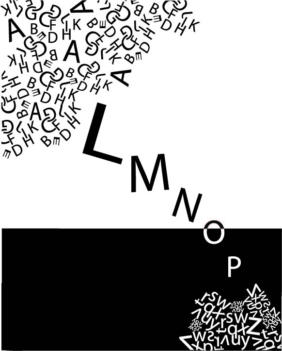
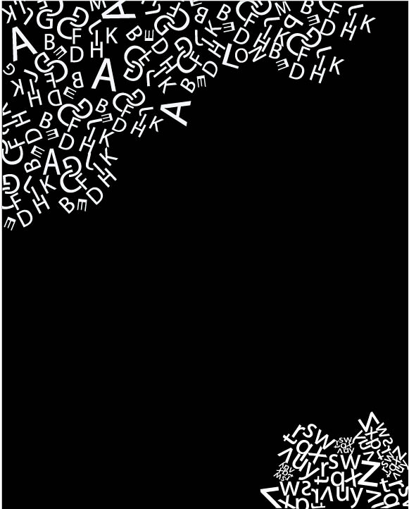
The first image has the most potential and I like the “swarm” in the upper left. The larger letters take away from the delicacy.
Maybe play with two separate swarms that leave a dynamic void space between them.
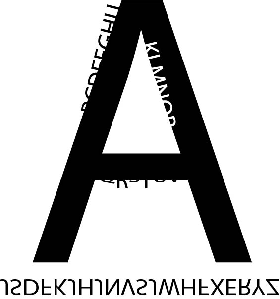
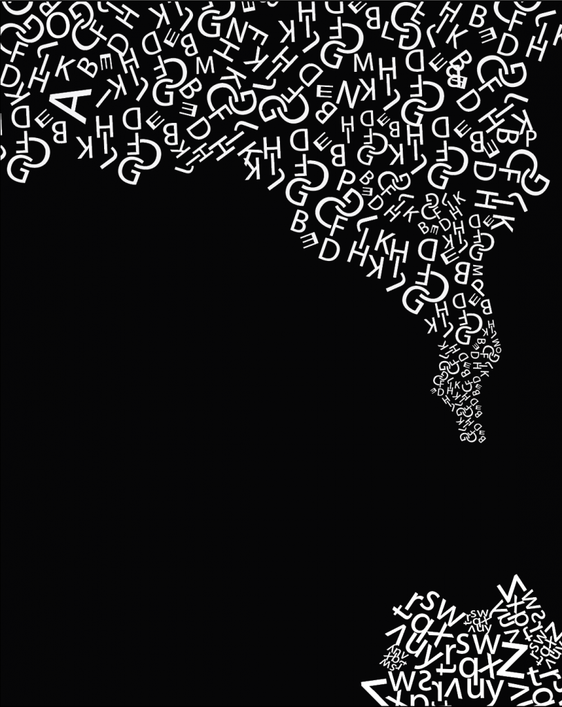
Really like this last one, You really spent put some time in the upper construction and it fills the space nicely with an effective organic contour.
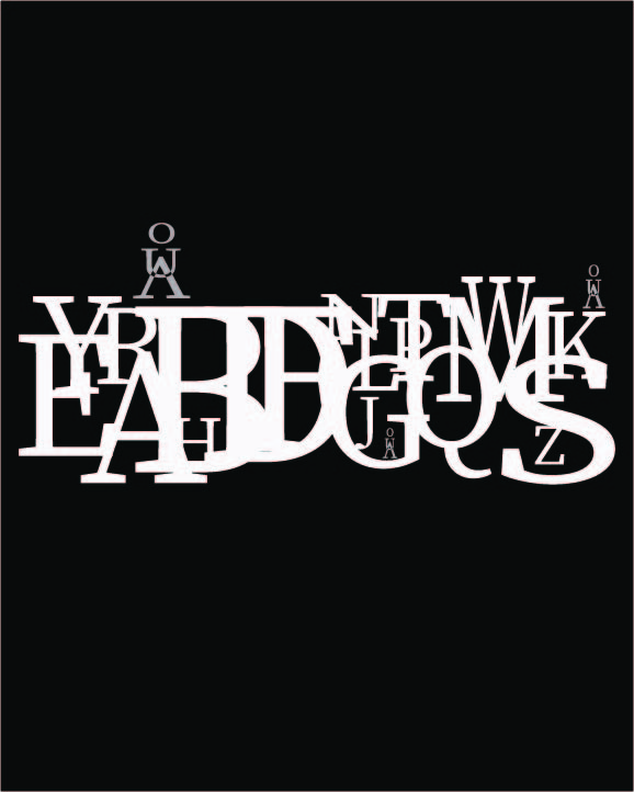
I do like the way you’ve activated the space between the corners, but feel the lower right shape isn’t quite as effective. I’m not sure if you were going for a volcano vibe, but I might prefer a similar approach to the upper contour, just at a smaller scale. That way it might function more graphically and less representationally.

The first image has the most potential and I like the “swarm” in the upper left. The larger letters take away from the delicacy.
Maybe play with two separate swarms that leave a dynamic void space between them.
Really like this last one, You really spent put some time in the upper construction and it fills the space nicely with an effective organic contour.
I do like the way you’ve activated the space between the corners, but feel the lower right shape isn’t quite as effective. I’m not sure if you were going for a volcano vibe, but I might prefer a similar approach to the upper contour, just at a smaller scale. That way it might function more graphically and less representationally.