I like the idea but I think you can get more creative with the teapot itself. Maybe make it out of only letters or just outline it and allow the viewer to see into it and see the letters about to be poured.
I actually like the heavier visual weight of the teapot and the composition is nicely considered. I might try to make sure that all the pouring letters are slightly rotated since a few are not (r, k, n).
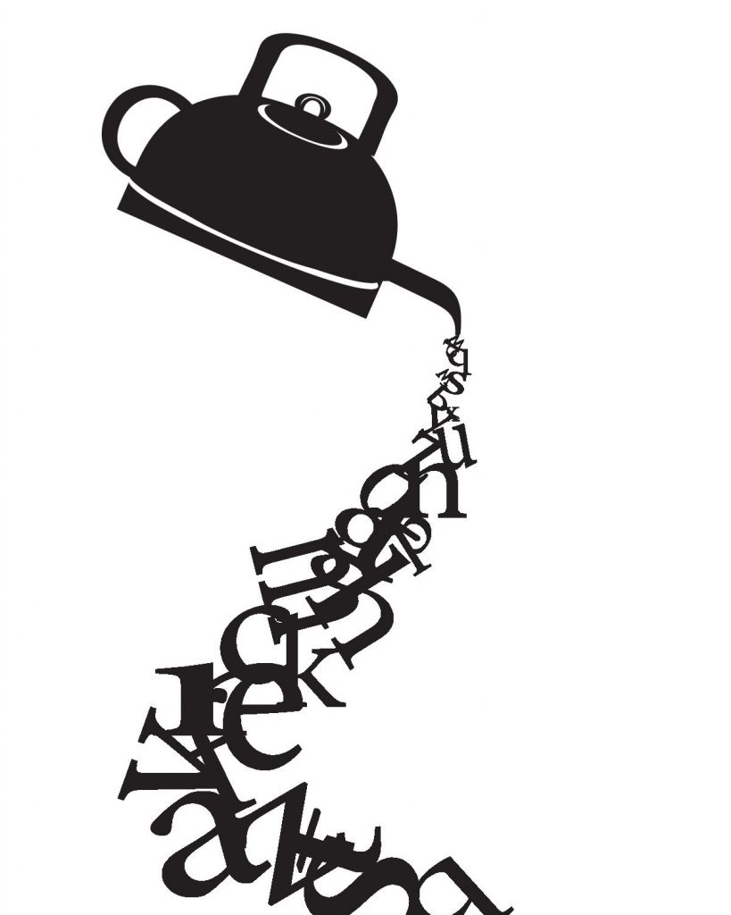
I also like a the “heavy” teapot! Maybe a solution to make the teapot itself more whimsical could be to make the handles the “C” and the “D”