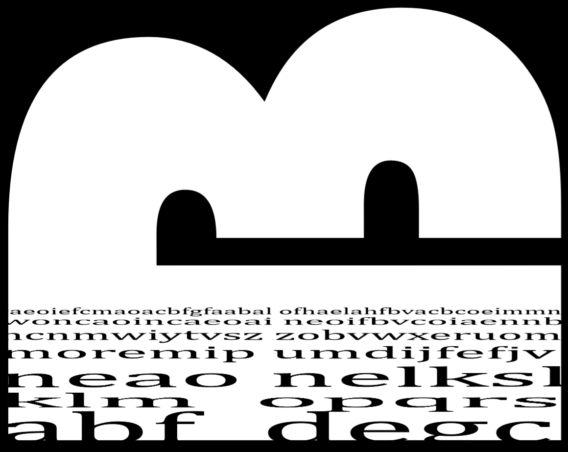
There is a lot of potential with this. The top half really grabs me but I want the letters to too. I like how they offer the piece perspective but you could emphasize that more – maybe make stairs in the distance or some other architectural addition.
Love the top half, too. It does a great job of carving up the space and also creates a mysterious narrative. I like that you’re thinking about activating a spatial read on the lower portion but agree that you can do something more dynamic that works with the top. Maybe a reduction of scale or value of the elements?
Maybe try a version where the intriguing white object breaks the black frame on the lower right (and maybe also the front?) i.e. so there’s not a black frame around the whole thing.