You’re definitely on to something here and the central element is beautifully designed. Love the implied horizontal/vertical voids. The tumbling letters don’t quite fit yet. Maybe you could use the remaining letters in a delicate barely-visible screen pattern behind the main element.

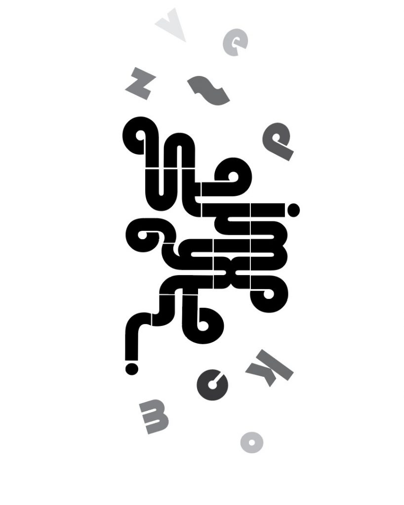
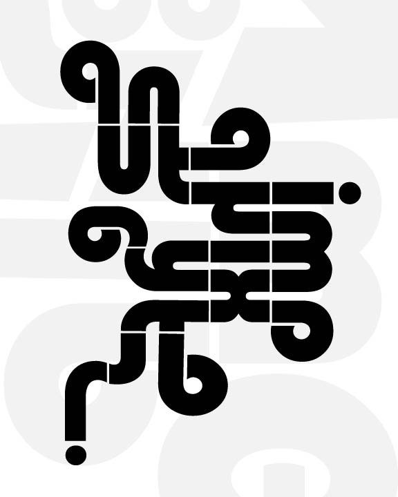
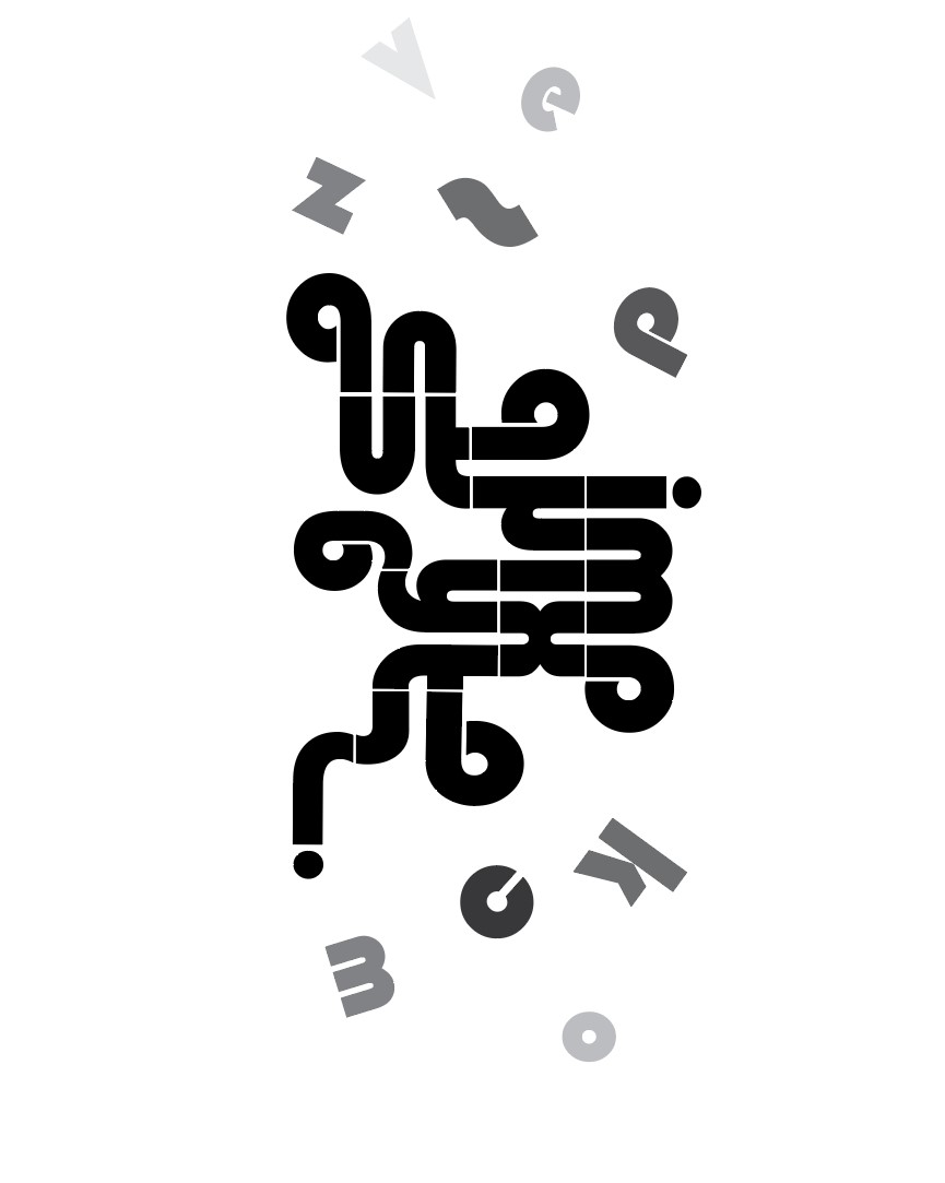
You’re definitely on to something here and the central element is beautifully designed. Love the implied horizontal/vertical voids. The tumbling letters don’t quite fit yet. Maybe you could use the remaining letters in a delicate barely-visible screen pattern behind the main element.
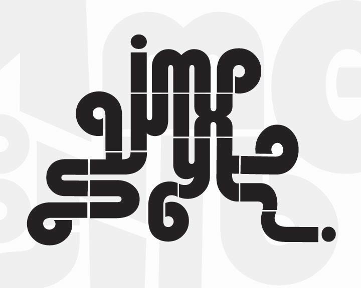
Much better. I’d be curious to see it rotated 90 degrees counterclockwise.