The play on Ozark is great. If you do some googling, it looks like the symbols used this season actually spell out “Z” “A” “R” and “K” …It would be really cool to use the letters to do something subtle and similar? Where they look like objects/architectural but are actually letters

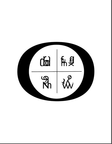
A fun take on the Ozark icons, but the interior graphics could be more dynamic (without being obvious) I like the lower right icon best.
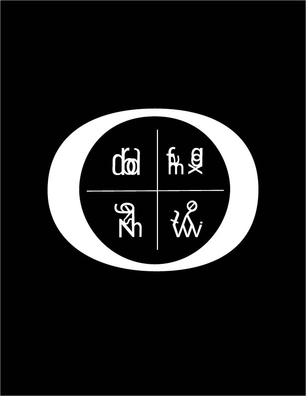
Graphically the second concept has a playful aesthetic that has potential. Just needs some refinement, but the main structure is solid..
The play on Ozark is great. If you do some googling, it looks like the symbols used this season actually spell out “Z” “A” “R” and “K” …It would be really cool to use the letters to do something subtle and similar? Where they look like objects/architectural but are actually letters