#2 has a nice sense of scale and movement, but needs better compositional placement. XY & Z aren’t working as well, so maybe stick with the more linear sliding movement like the other smaller letters.
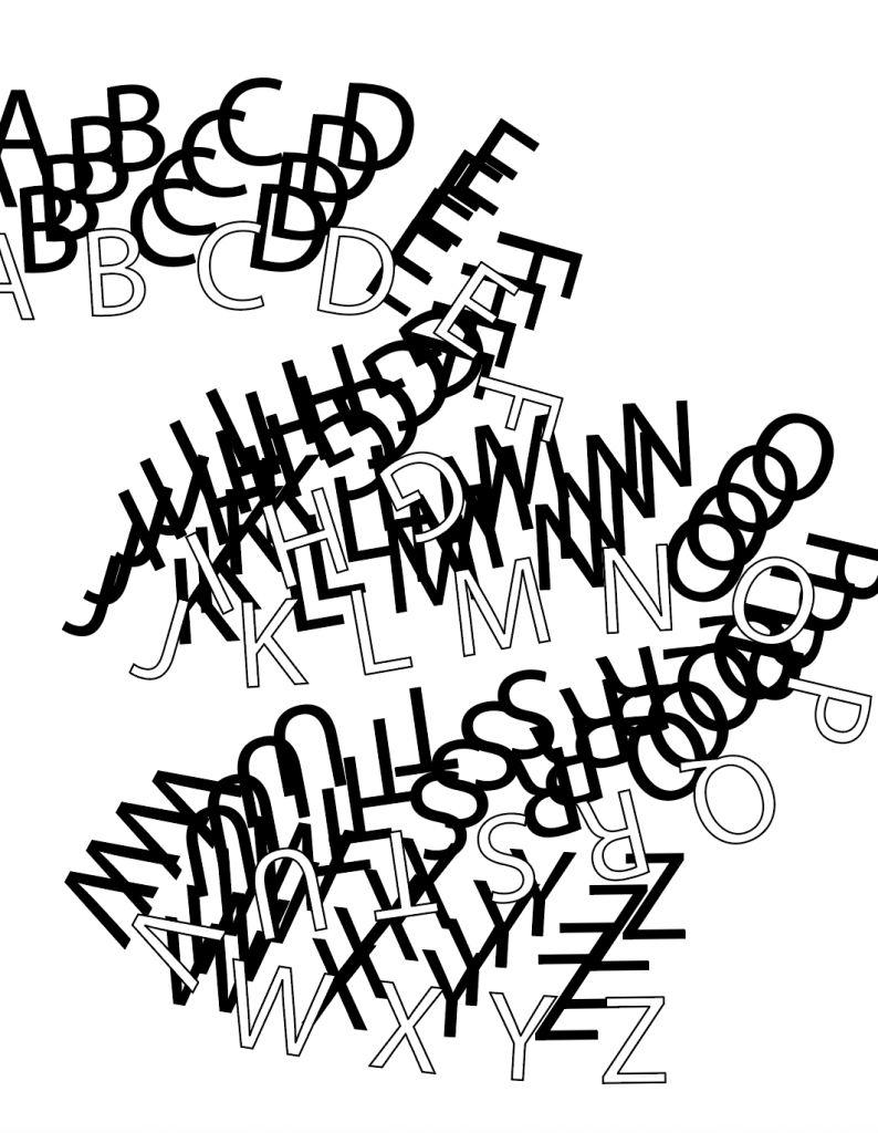
I also like the S dividing the ground in #3 but the remaining elements feel random. Perhaps try a similar approach to what you did with the smaller letters in #2.
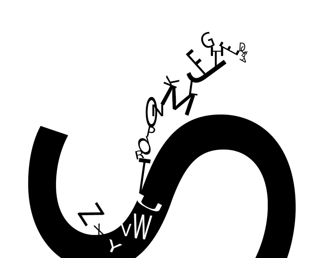
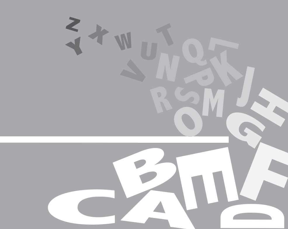
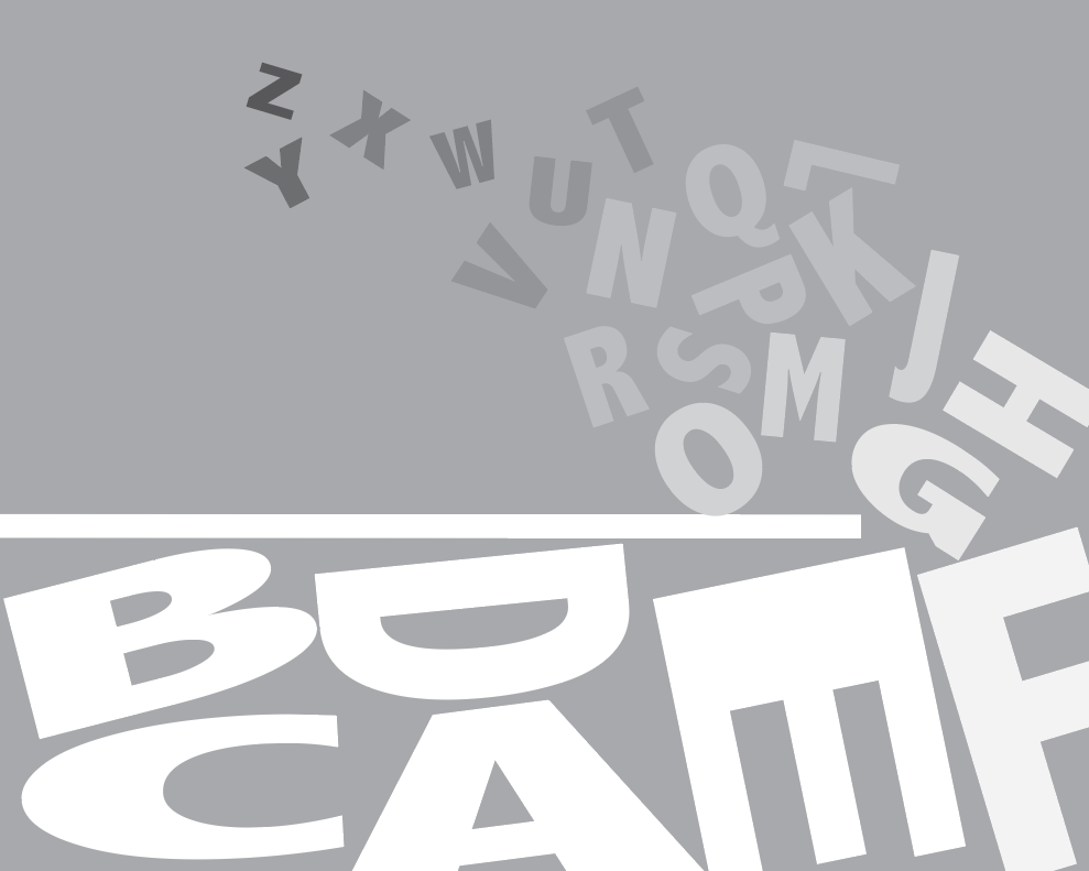
I like the new one (AS5) The upper half is nicely arranged and creates an organic drifting quality. The lower letters aren’t working as well. I think they either need to fill the space in an airtight way or maybe you should just leave the lower space open and integrate the remaining letters at a smaller scale in the drift or elsewhere. I do like the way the horizontal creates a firm base and the O balances well there too.

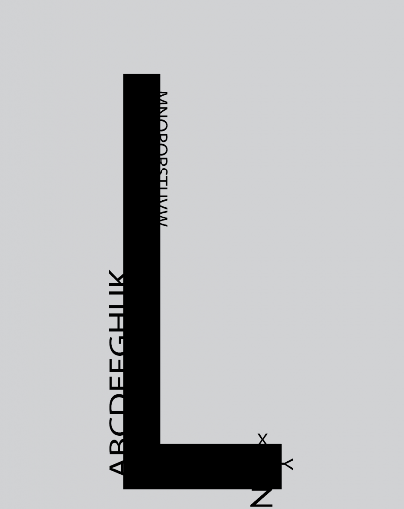
#2 has a nice sense of scale and movement, but needs better compositional placement. XY & Z aren’t working as well, so maybe stick with the more linear sliding movement like the other smaller letters.
I also like the S dividing the ground in #3 but the remaining elements feel random. Perhaps try a similar approach to what you did with the smaller letters in #2.
I like the new one (AS5) The upper half is nicely arranged and creates an organic drifting quality. The lower letters aren’t working as well. I think they either need to fill the space in an airtight way or maybe you should just leave the lower space open and integrate the remaining letters at a smaller scale in the drift or elsewhere. I do like the way the horizontal creates a firm base and the O balances well there too.