Cool idea but to make it more engaging I think if you had a flood of letters raining down and hitting the umbrella that would be better. And you should keep them from going back under the umbrella emphasize the umbrella’s shape which will create a better composition.
Love Sophia’s suggestion above about having the letters “rain” down. I would love to see the letters themselves be smaller. Maybe play around with black letters on a white background or black letters on a light grey background.

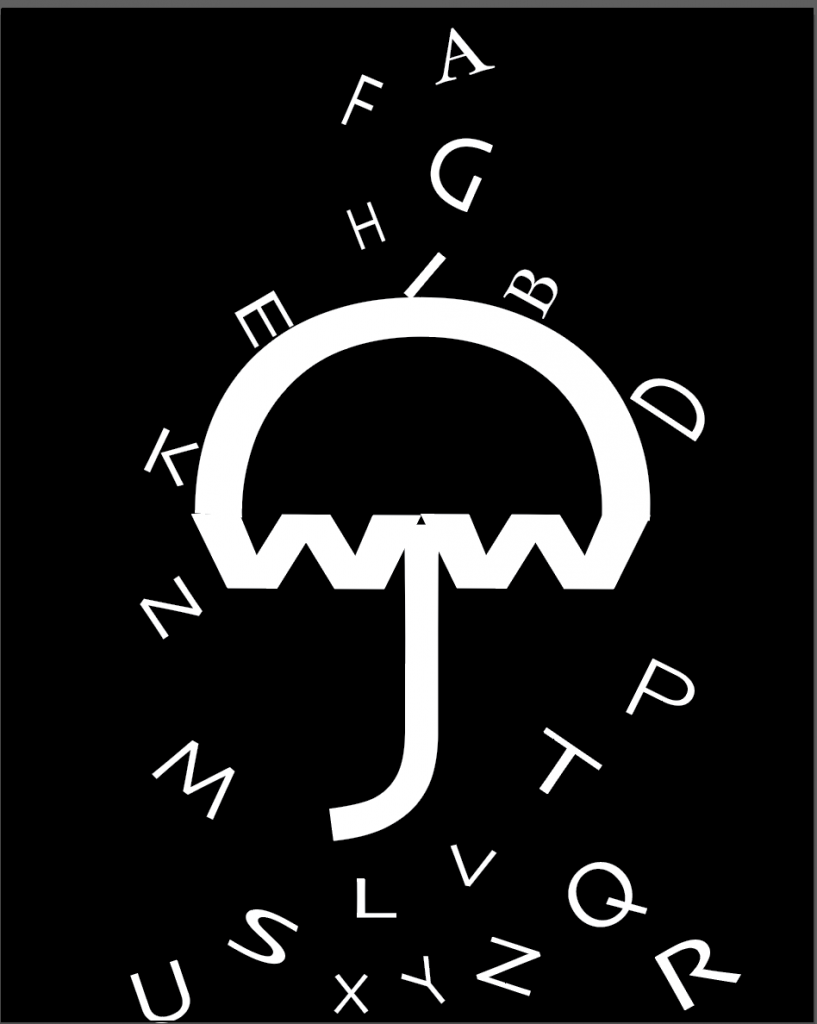
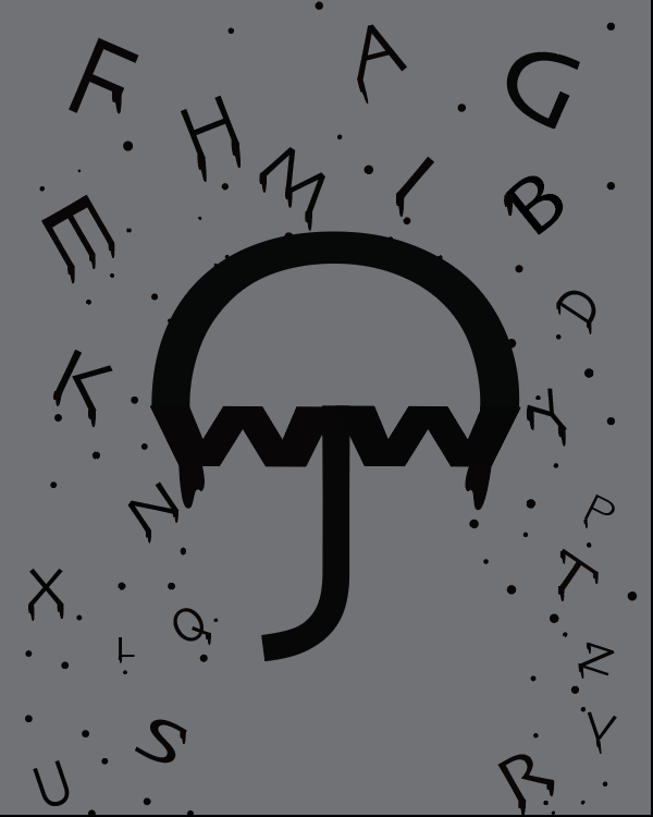
The umbrella element could be more graphically compelling and ‘d like to see some alternate options for the falling letters to aid the composition.
Cool idea but to make it more engaging I think if you had a flood of letters raining down and hitting the umbrella that would be better. And you should keep them from going back under the umbrella emphasize the umbrella’s shape which will create a better composition.
Love Sophia’s suggestion above about having the letters “rain” down. I would love to see the letters themselves be smaller. Maybe play around with black letters on a white background or black letters on a light grey background.