I do like the top because it looks like a poster but I agree the bottom is more interesting. If you’re going for the A and B to be falling or about to fall just play around with that more its a fun idea.
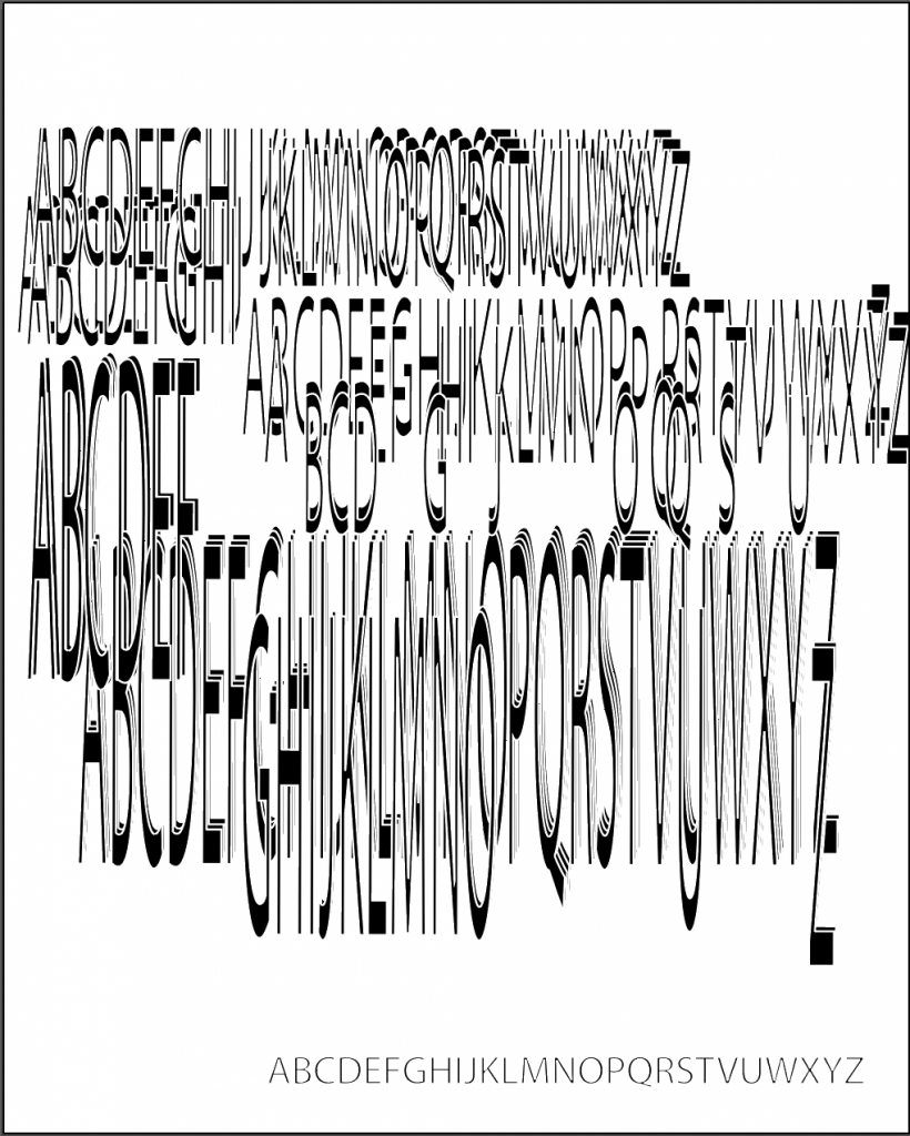
#2 is a really nice start! I like the way that the J creates a base for all of these tumbling letters, but i’d like to see it play with gravity (the way the bottom of the j is lower than the top isn’t the way it would naturally rest). Maybe there’s a group of letters holding it up this way, or you could try flipping it upside down. It also doesn’t have to necessarily be a J! It looks like you have a second J in above (in addition to missing a few letters).


The stacked elements in #2 have potential. Just refine it a bit (and find a better spot for the A and B)
I do like the top because it looks like a poster but I agree the bottom is more interesting. If you’re going for the A and B to be falling or about to fall just play around with that more its a fun idea.
#2 is a really nice start! I like the way that the J creates a base for all of these tumbling letters, but i’d like to see it play with gravity (the way the bottom of the j is lower than the top isn’t the way it would naturally rest). Maybe there’s a group of letters holding it up this way, or you could try flipping it upside down. It also doesn’t have to necessarily be a J! It looks like you have a second J in above (in addition to missing a few letters).