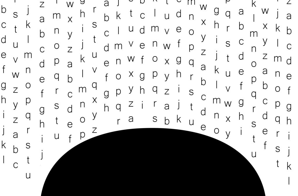
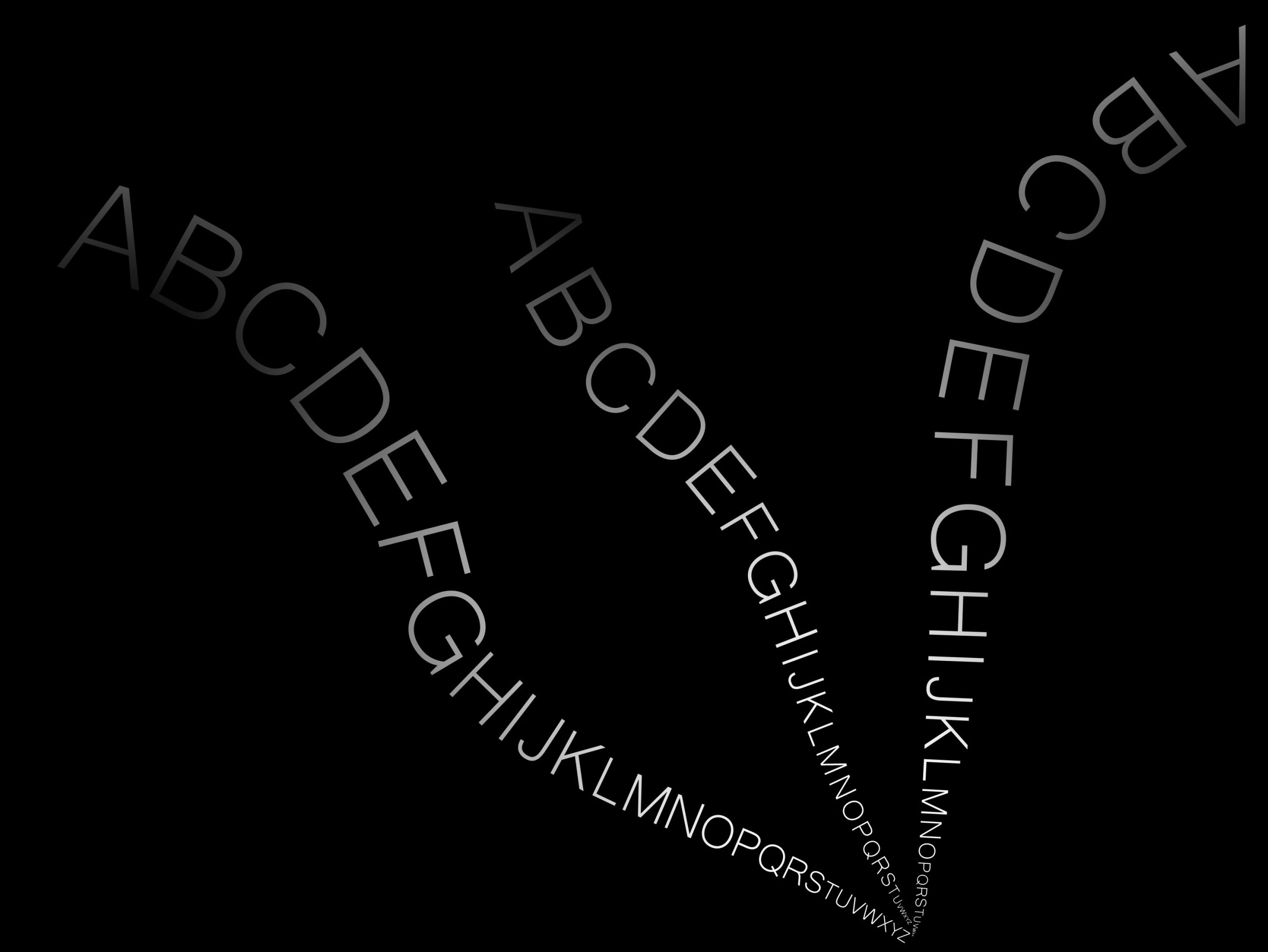
I appreciate all the alternates!
#1 is most successful as is. Just lose the gradient. I like the bold element on the bottom and the delicate ripple of text above.
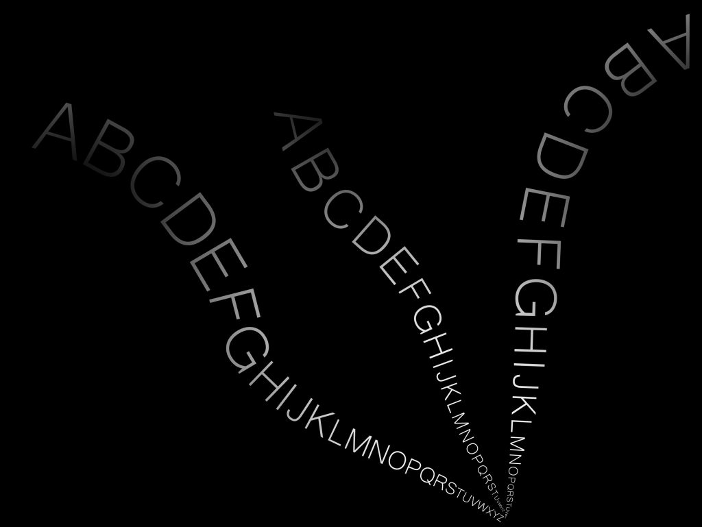
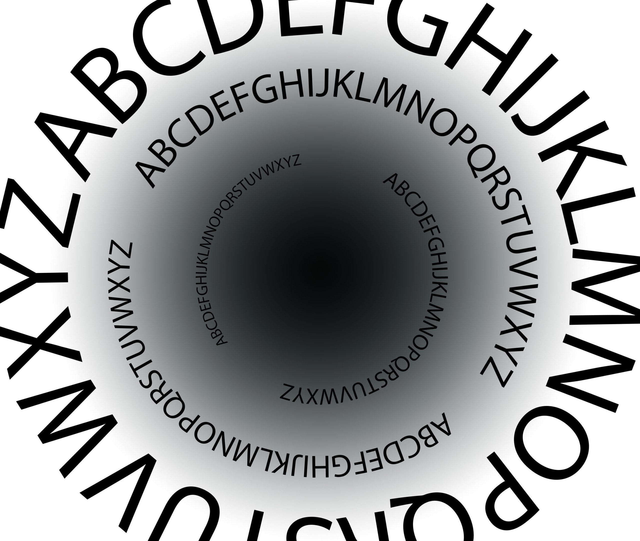
#2 has potential also but needs more tweaking. I do like the absence in the lower right.
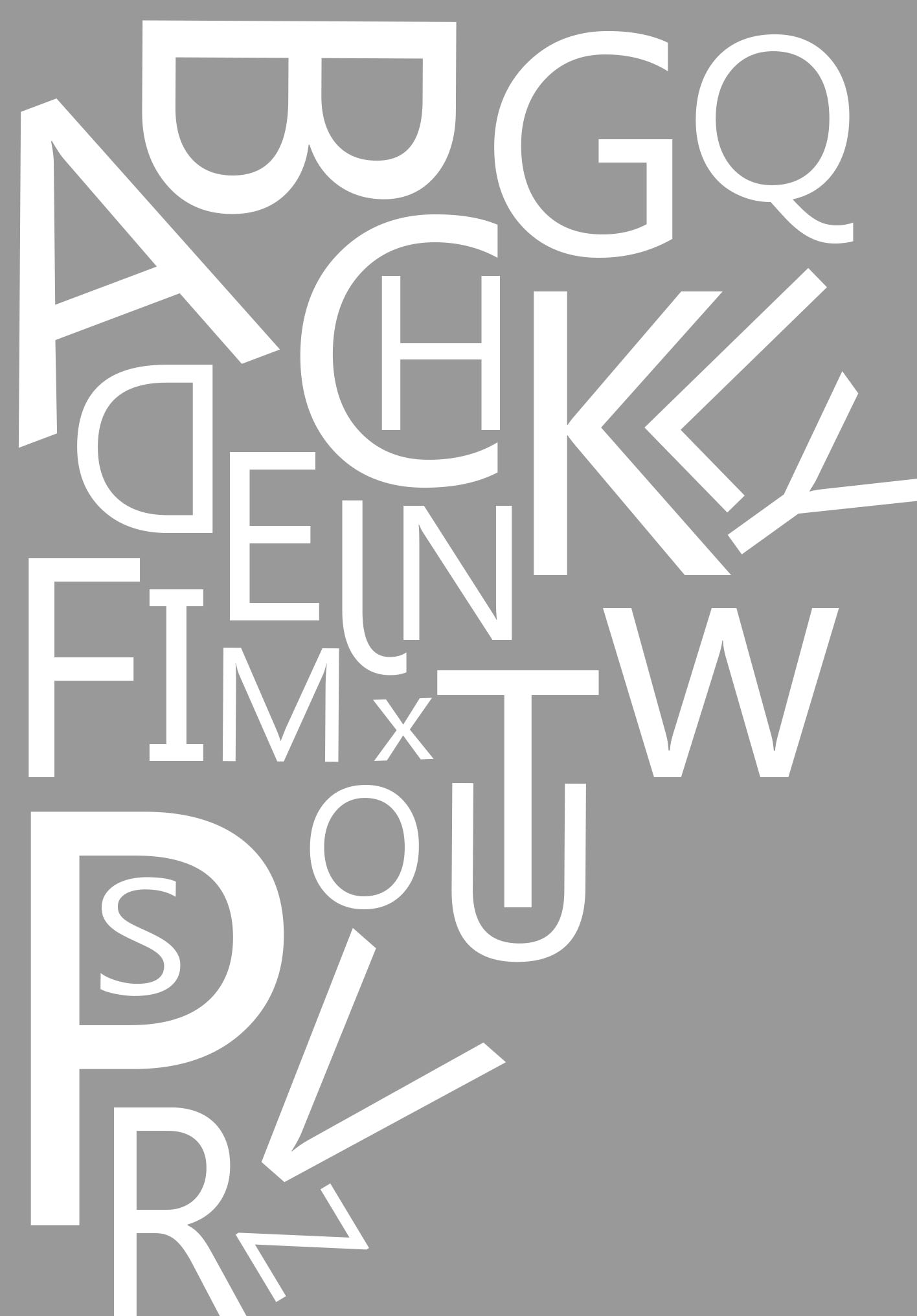
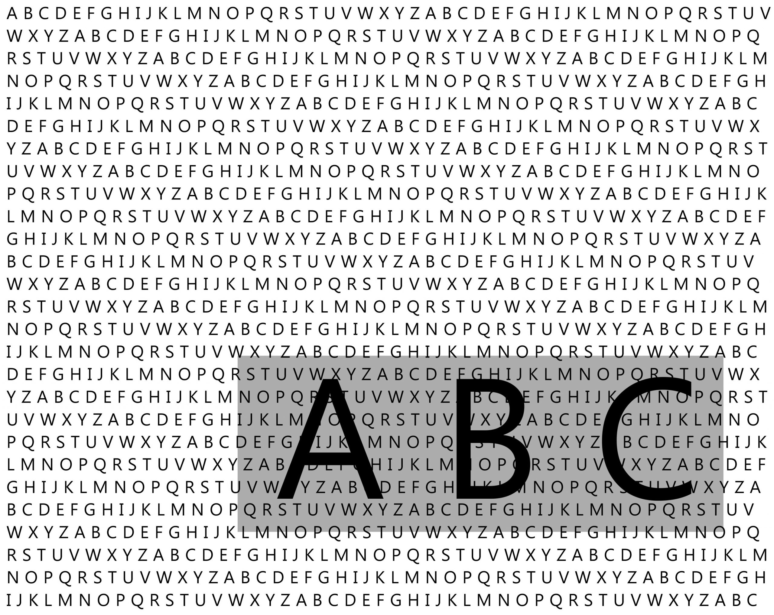
#4 also has some nice gaps and cropping, but again, lose the gradient.


I appreciate all the alternates!
#1 is most successful as is. Just lose the gradient. I like the bold element on the bottom and the delicate ripple of text above.
#2 has potential also but needs more tweaking. I do like the absence in the lower right.
#4 also has some nice gaps and cropping, but again, lose the gradient.