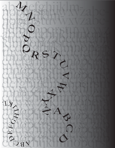
Some nice movement with the path type, but perhaps allow it to flow off the page.
The texture is intriguing too, but there’s a lot going on. Perhaps try containing it just to the area between the path type with the texture (or vice-versa in the ground space) so it doesn’t cover the whole ground and there’s some breathing room.
And maybe try a version without the gradient.
I agree that it would be great to see this without the gradient. Have you tried playing around with sans serif letters? You could adjust the scale of the letters along the path type to create an interesting effect.