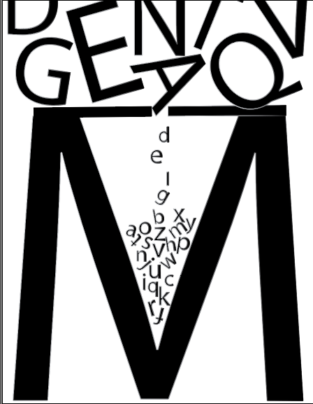
Not bad. I like the tiny gap you’ve created atop the M. Maybe have the Q hover just above (rather than fusing it) to keep it consistent.
And maybe rotate the D and N just a bit since everything else is a little off balance,
I like the form in the new design. It seems like it needs to commit to a more orderly integration of letters or a more chaotic fill (like near the top) I’m inclined to think that the more orderly approach will work better.