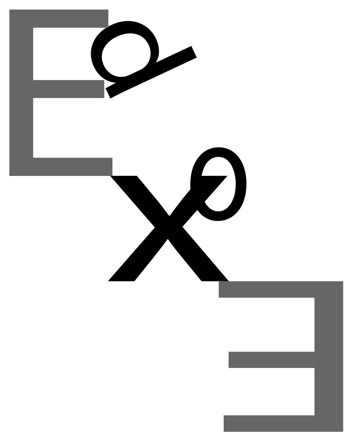
You’re on to something with the E and X creating some interesting compositional containment. Perhaps mirror the Es in the opposite corners as well. The D and O aren’t working as well.
I love the idea of doing something architectural with this. The X and the E are both very structural letters and I like how you play around with balance in the above. As you are working, you could make the artboard larger so that you don’t feel as confined to the letter size page (as the E’s make me feel in the above). Then crop down later depending on where the structure takes you! You could also try flipping the artboard sideways and play around with balance that way!


You’re on to something with the E and X creating some interesting compositional containment. Perhaps mirror the Es in the opposite corners as well. The D and O aren’t working as well.
I like how graphic it is but I think there should be more variation in the Es and X and for more drama.
I love the idea of doing something architectural with this. The X and the E are both very structural letters and I like how you play around with balance in the above. As you are working, you could make the artboard larger so that you don’t feel as confined to the letter size page (as the E’s make me feel in the above). Then crop down later depending on where the structure takes you! You could also try flipping the artboard sideways and play around with balance that way!