
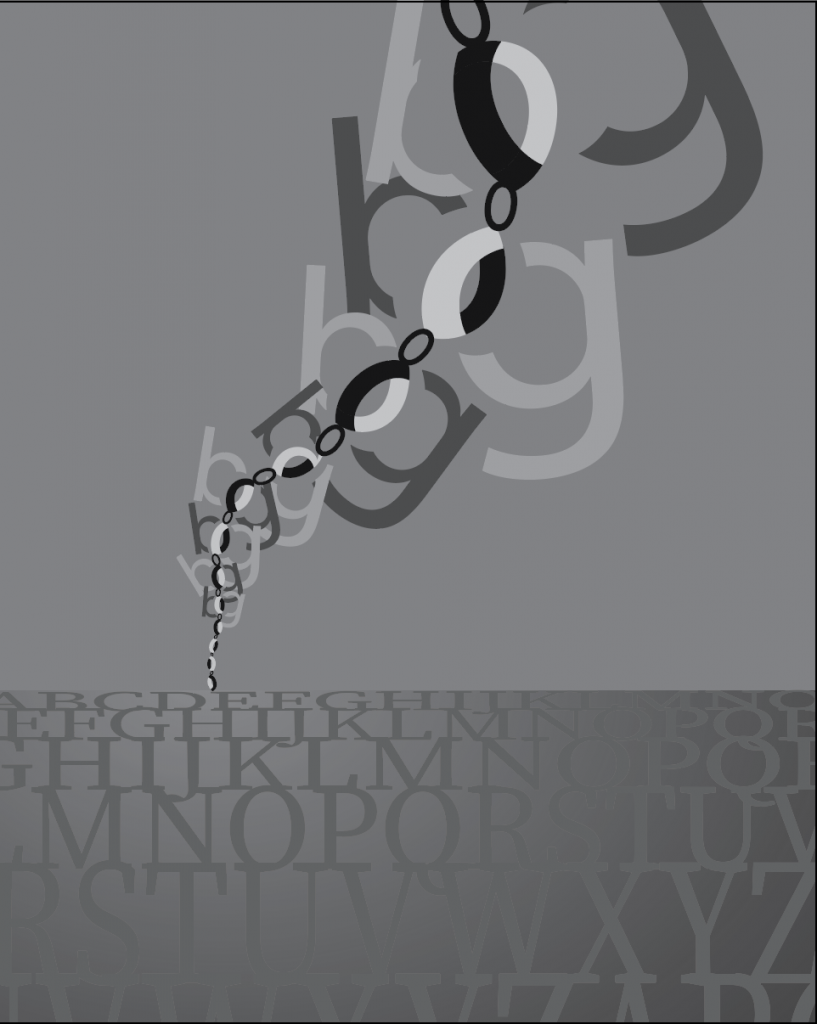
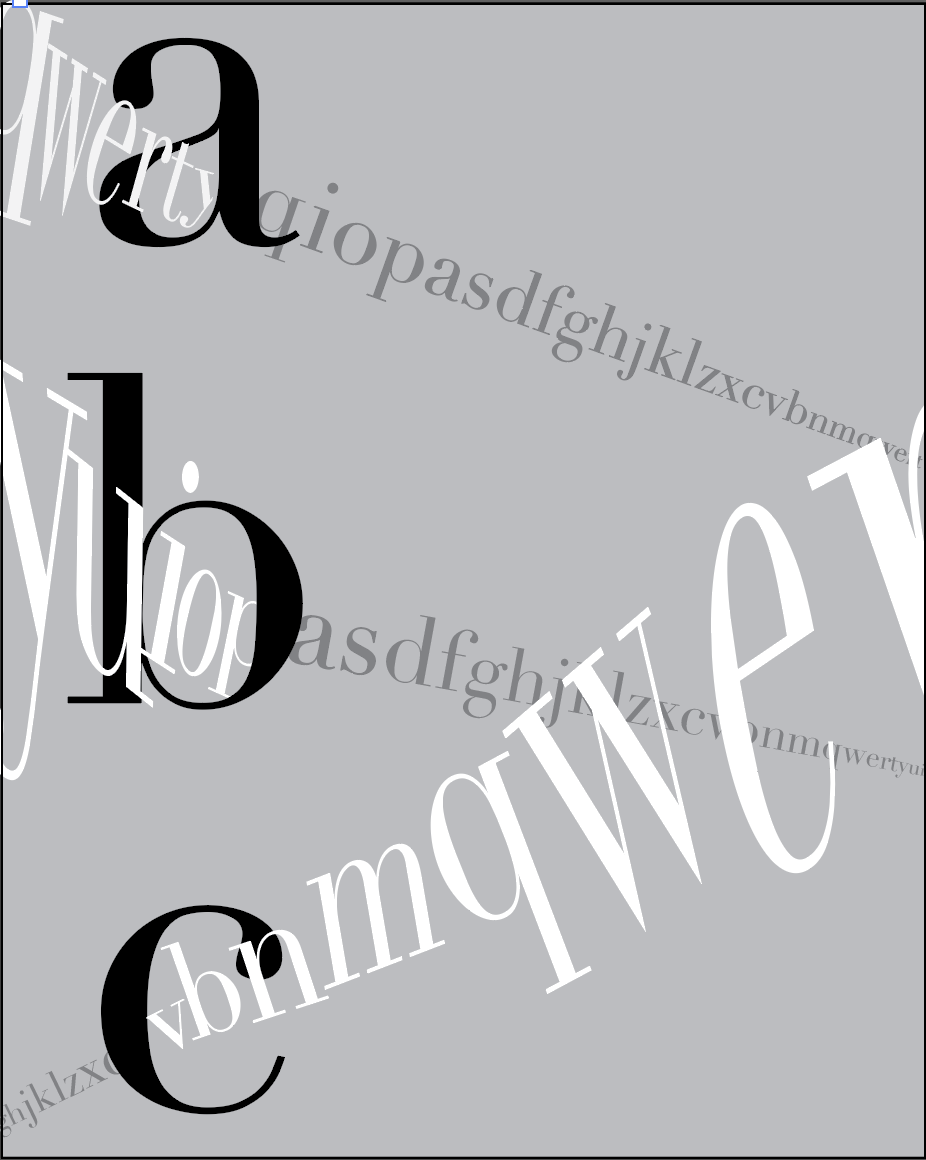
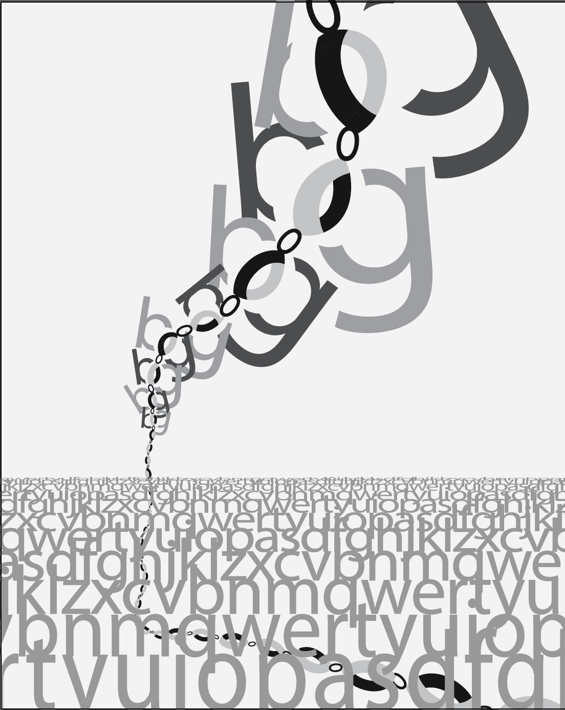
I have 2 new variations of the “chain” one, where I updated the bottom half a bit. There’s another trial with a different approach as well.
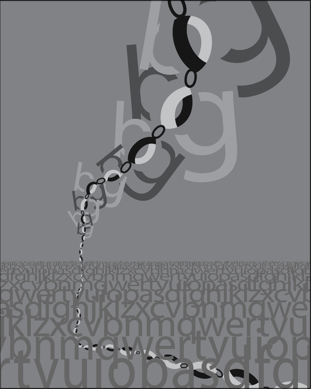
I have 2 new variations of the “chain” one, where I updated the bottom half a bit. There’s another trial with a different approach as well.
You must be logged in to post a comment.
Looks good. Nice construction in the upper portion. It has a nice sense of scale and weightlessness.
The horizon/ground plane is a strong concept too. You could experiment with a smaller scaled text fill and maybe try it without the gradient but overall you did a nice job with the concept and composition.
I like it on the lighter ground. Perhaps just lighten the value on the lower letters and I don’t think you need the reflective element.
I also like the spatial quality on the new one, but the ABC elements don’t seem necessary.