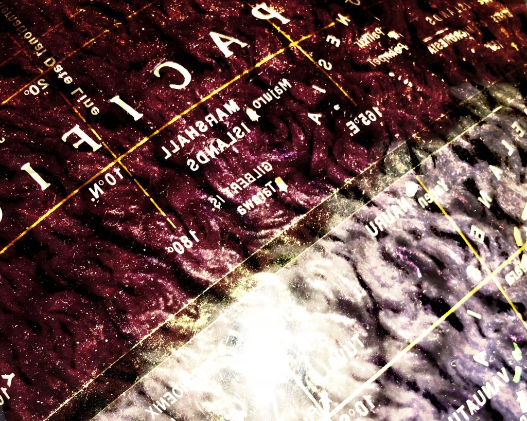
I think it was smart to flip the image to make the text backwards because that is more interesting and you have good composition with the dividing black line. My problem with this piece is that it still kind of looks like one picture of a textured globe with the flash reflection that was saturated and I wish there was another component that was a little more visible/contrasting.

I think it was smart to flip the image to make the text backwards because that is more interesting and you have good composition with the dividing black line. My problem with this piece is that it still kind of looks like one picture of a textured globe with the flash reflection that was saturated and I wish there was another component that was a little more visible/contrasting.
Color and contrast are nicely resolved. Maybe a tighter crop on the top and left to make the reversed-pacific less legible.