Looks good. The only element that feels a bit off-key is the gray band on the right. a little low in saturation and I’d prefer to not have it visible atop the glass.
I don’t mind the text element but the rectangular containment is the only vertical element in the composition and a bit off-key in its low saturation. It’s not a really big deal but I thought you could possibly erase the upper portion where it crosses the glass. Gain, not a big deal in the assessment, just a suggestion.

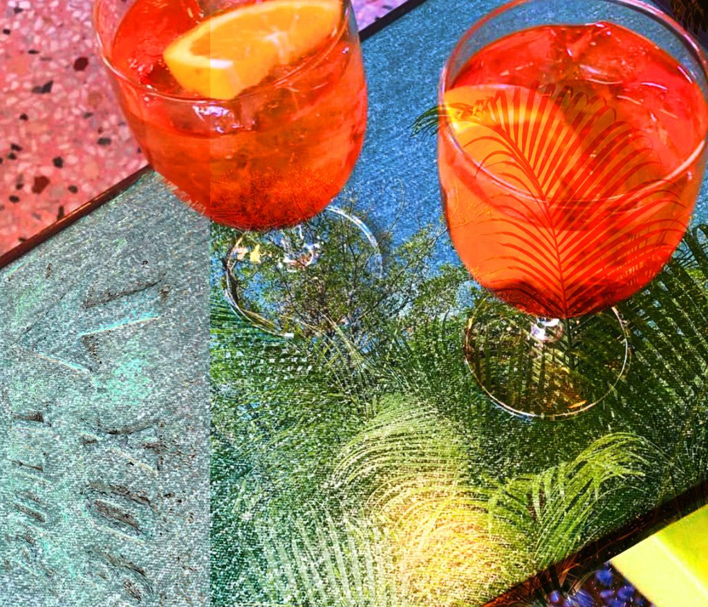
Looks good. The only element that feels a bit off-key is the gray band on the right. a little low in saturation and I’d prefer to not have it visible atop the glass.
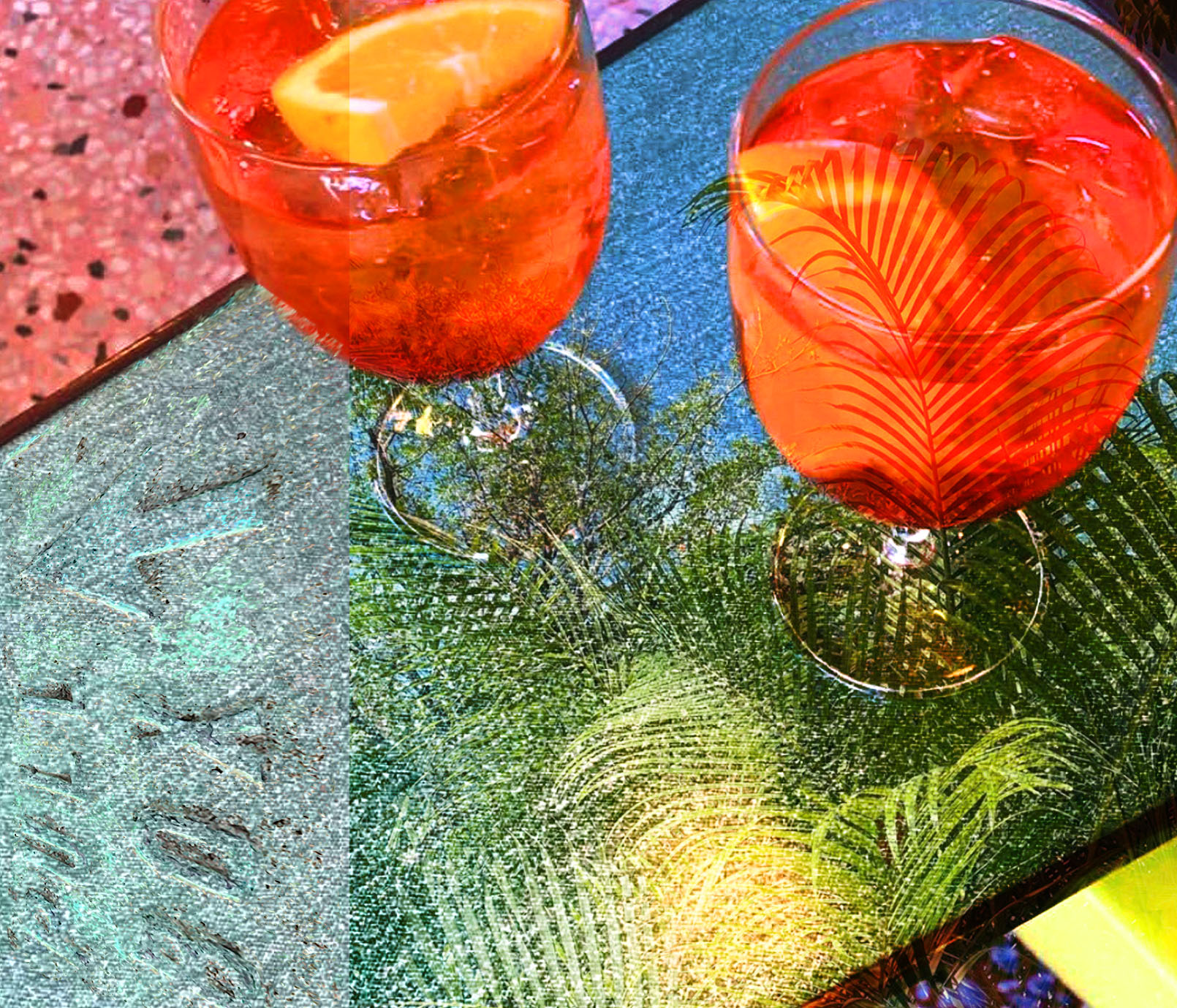
Thank you for the feedback. I slightly re-cropped the image to get rid of the dark corner in the top right. Am I able to submit this version as well?
You have til the end of the day to post revisions for the initial assessment.
Oops. I actually meant to say the gray band on the left! I think the right side is fine. Sorry for the confusion!
No worries. I’m a bit confused about which part on the left side you are referring to… is it the area with the text?
I don’t mind the text element but the rectangular containment is the only vertical element in the composition and a bit off-key in its low saturation. It’s not a really big deal but I thought you could possibly erase the upper portion where it crosses the glass. Gain, not a big deal in the assessment, just a suggestion.
I made the change and updated my re-edit submission. Thanks!