I am first drawn to the middle picture but I want there to be more overlap or manipulation with it. The Holy Bible one is also interesting but needs more contrast.
My advice in all three of these is to flip the type elements (edit>transform>flip horizontal) so they are not legible. I like the color and subtlety of #3 best but #2 also has potential.
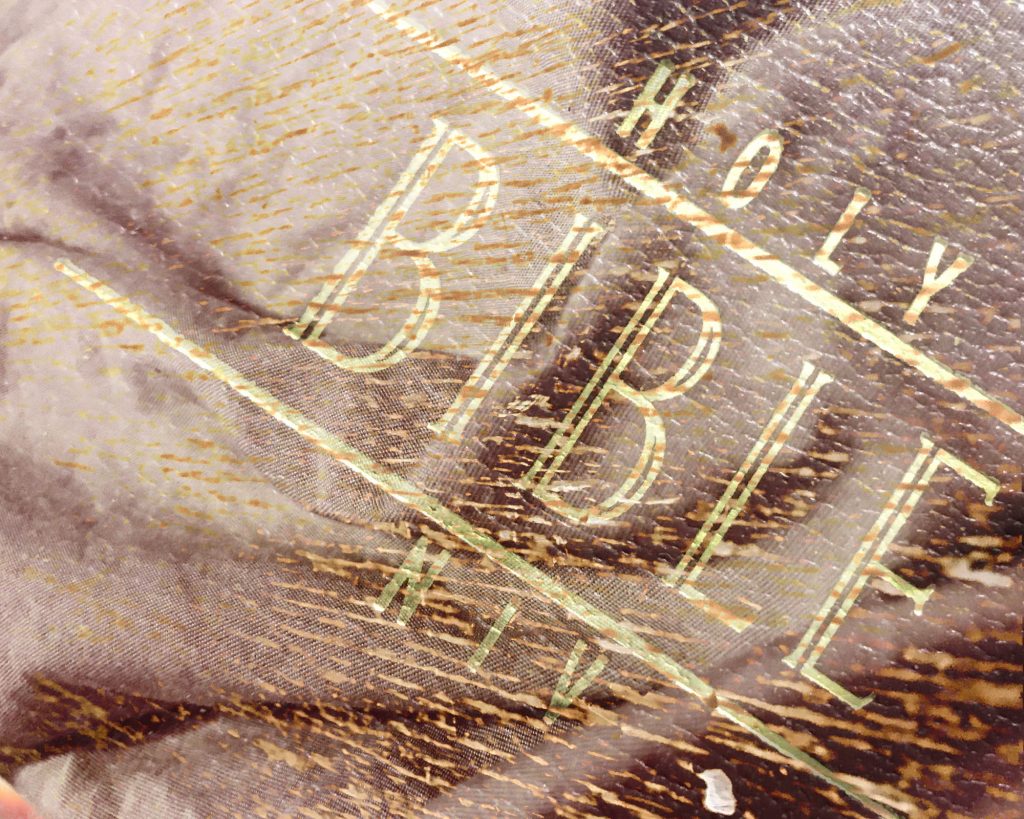
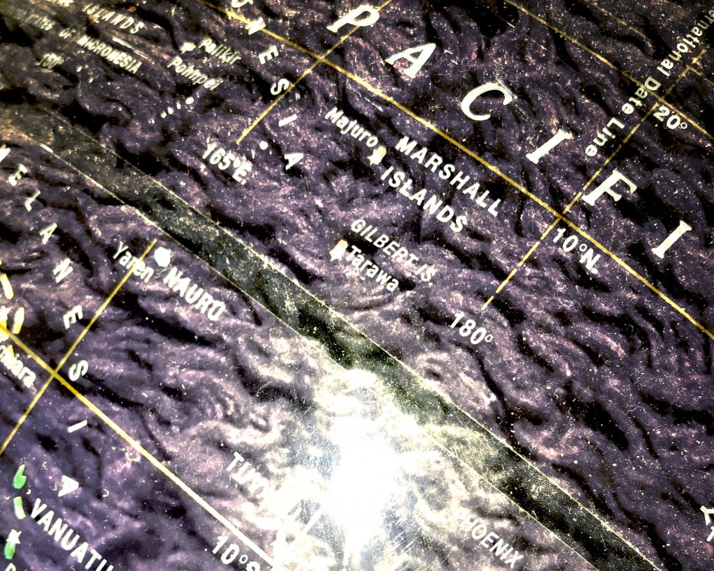
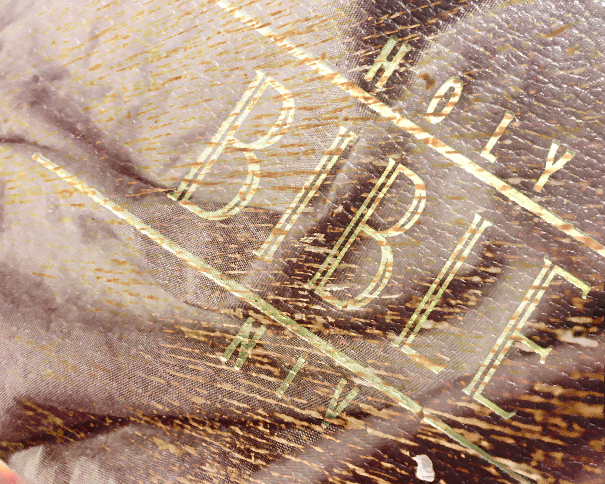