
So I used the combination of images I had and managed to make a few combinations before the scratch disk had its problems. I spoke with someone from LTS today and I believe as long as I can free up space on my computer as I go and not overwhelm it with too much material at once then I should be fine and encounter the problem less often.
That being said, I’m very into 1,2,4,6 but I look forward to seeing which you like! (also the website isnt letting me show them in their proper size and orientation for whatever reason, im hoping you can scroll through them and see them larger.
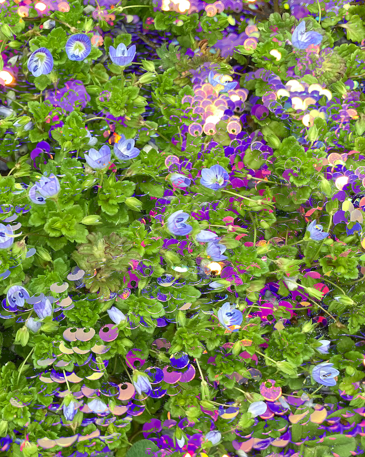
1: Lighter Color 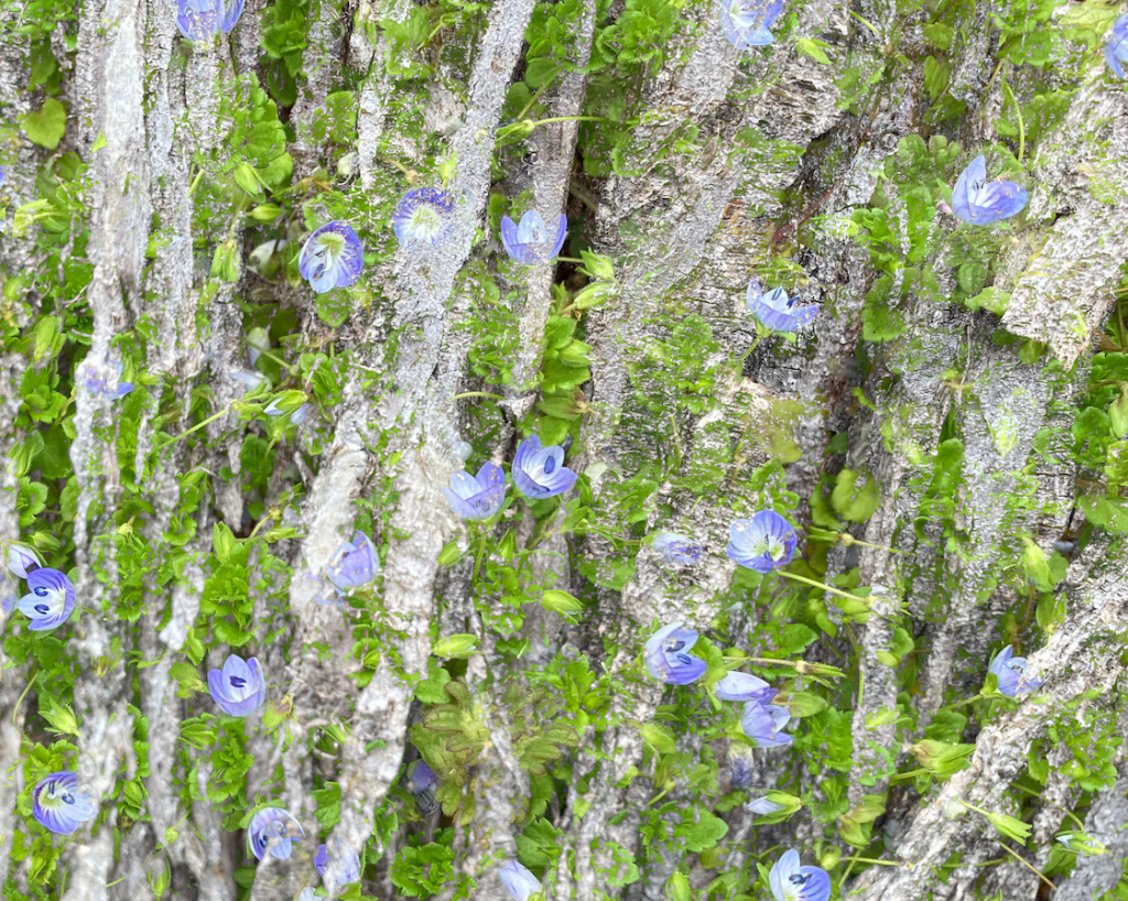
2: Lighter Color 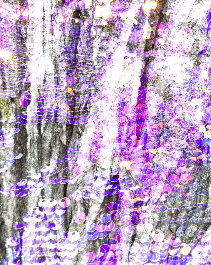
3: Linear Dodge 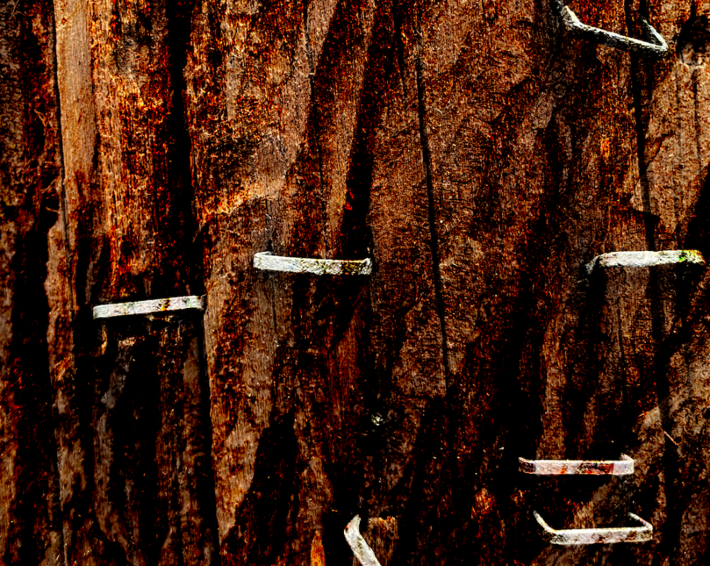
4: Color Burn 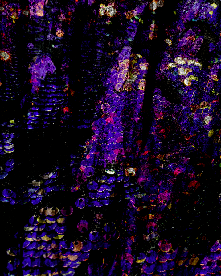
5: Linear Burn 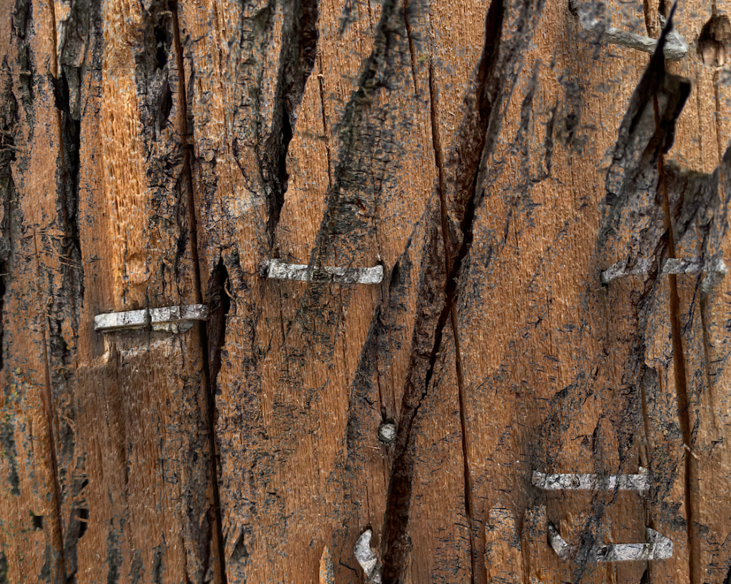
6: Darker Color 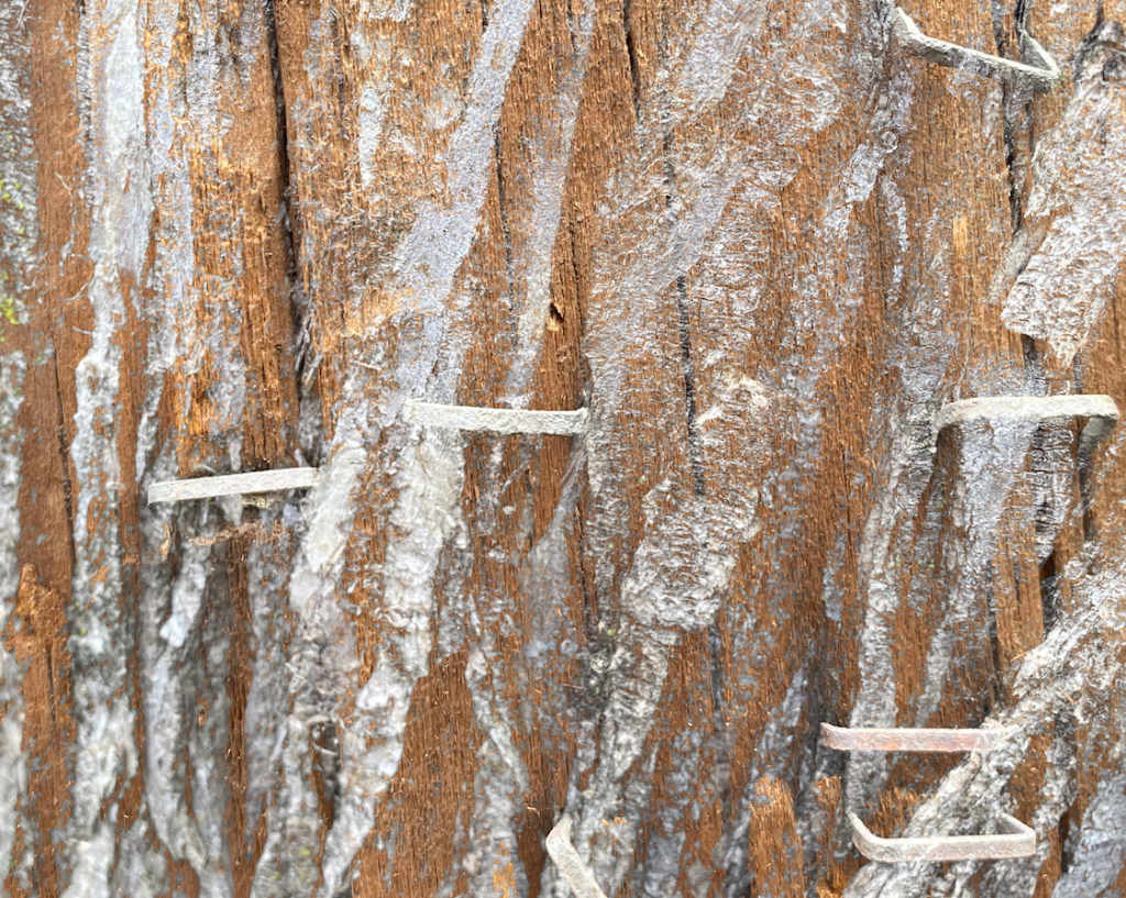
7: Lighter Color 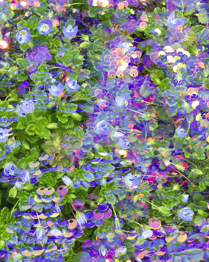
8: Lighten
Make sure to post these in a gallery so that we can mouse over the smaller thumbnails. They are all pretty flat spatially, so perhaps integrating another image with more depth might help. Or an image with more economy.
I like the color in #1 as a more decorative approach, but I still think you could push the contrast.
The staples are most intriguing graphically and I like the contrast in #4. Don’t forget the typographic element.