Good color and contrast in the piece with the glasses, but maybe crop it a bit tighter. Try to be more subtle with the text integration (or perhaps crop or flip it to have it function more graphically) Also like the right half of the second image. Log in to Reply

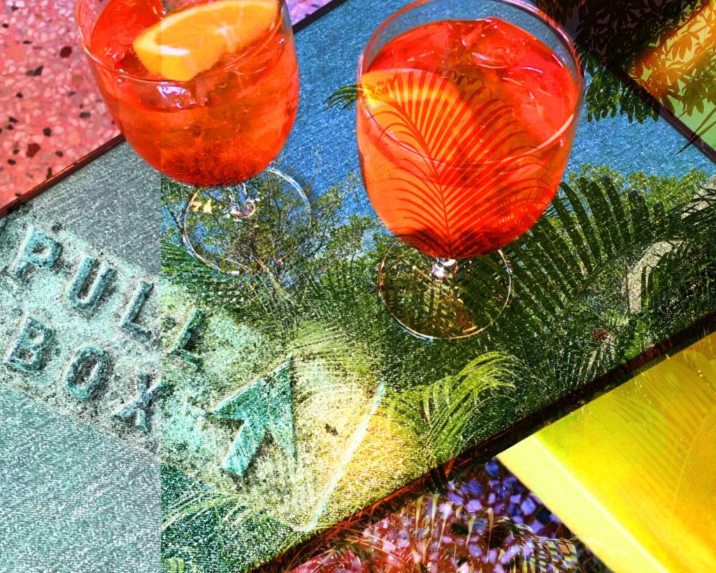
Good color and contrast in the piece with the glasses, but maybe crop it a bit tighter. Try to be more subtle with the text integration (or perhaps crop or flip it to have it function more graphically)
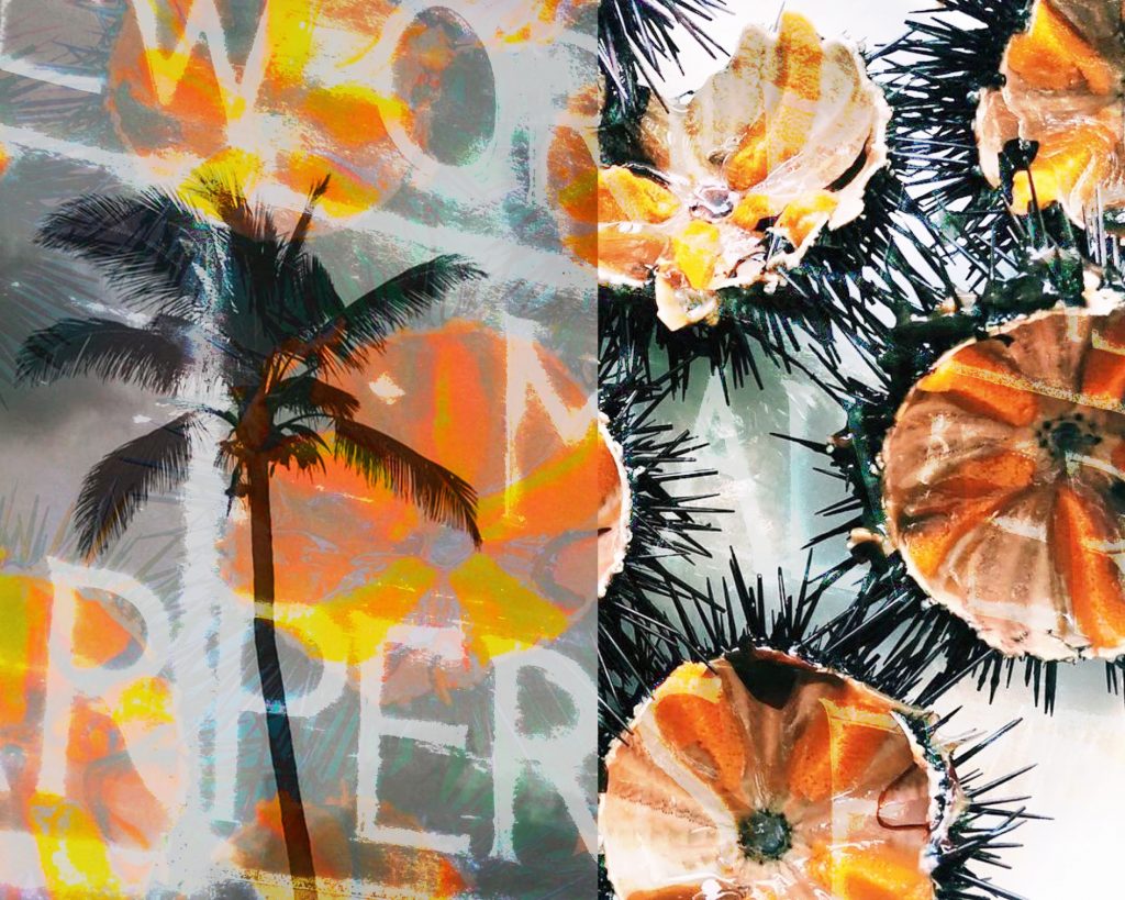
Also like the right half of the second image.