

Digital Texture Example Submissions
I provided updates of DT#4 with your suggestions to play around more with hue, saturation, and contrast. I incorporated Phia’s idea of bringing out the yellow. Also, I added some more euphoric-feeling textures.
DT#1 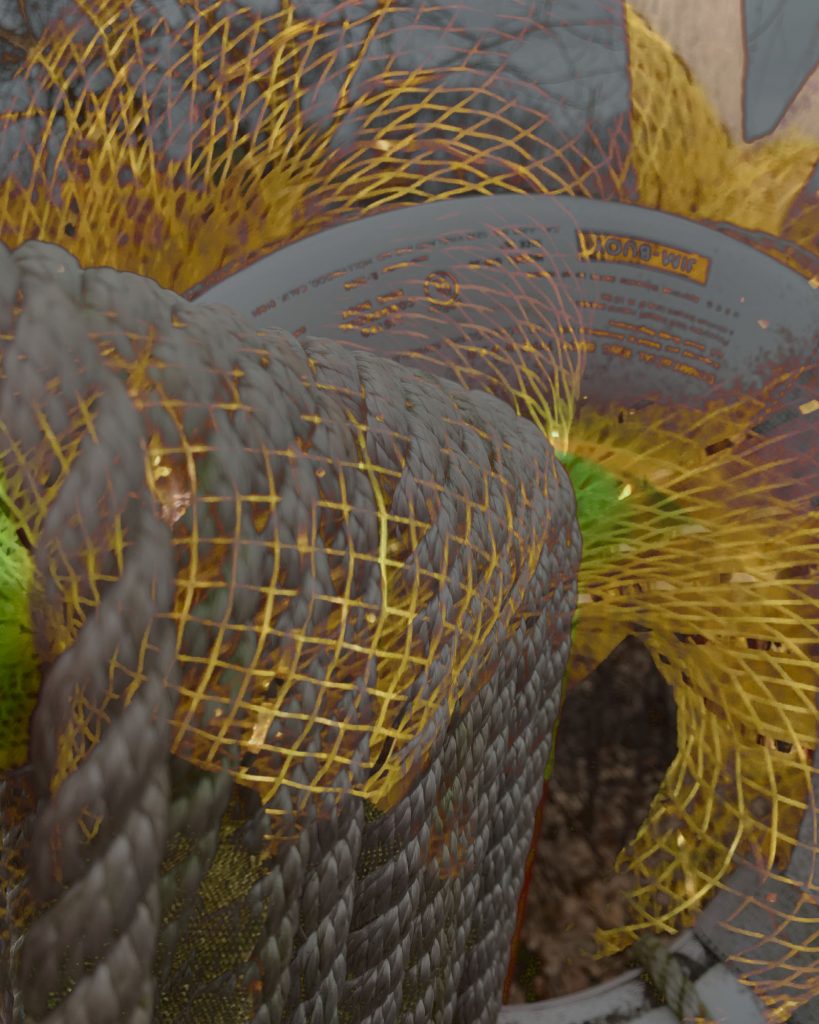
DT#2 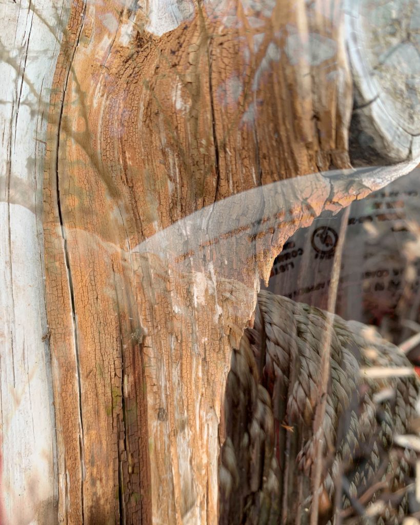
DT#3 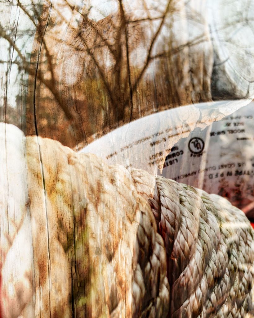
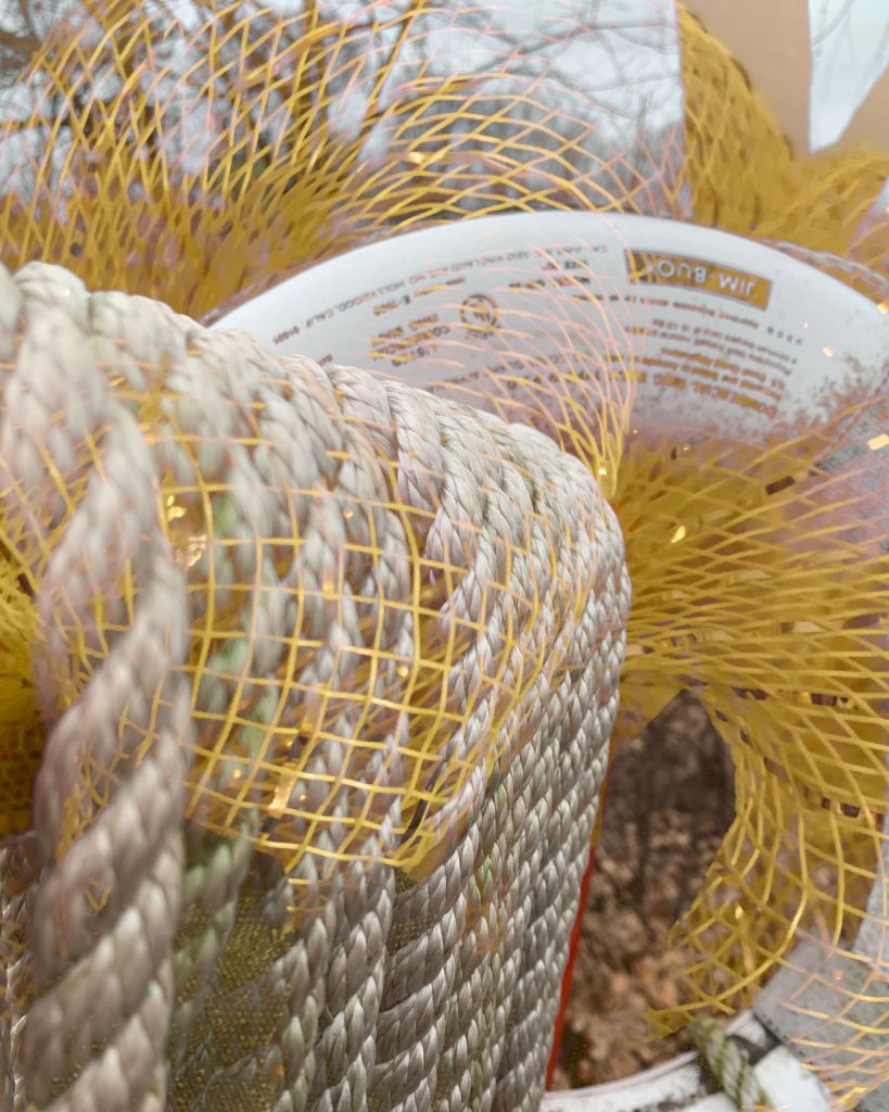
DT#4 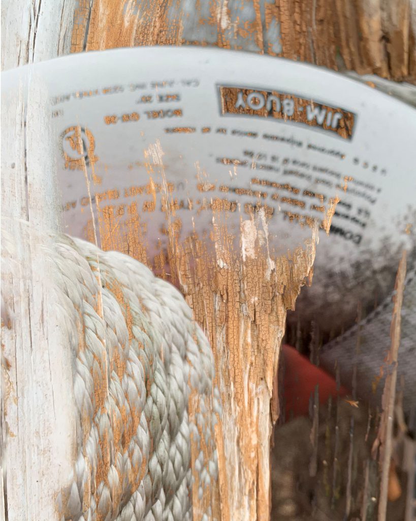
DT#5 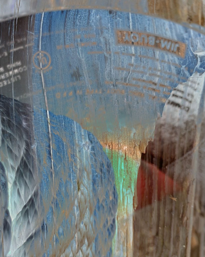
DT#6 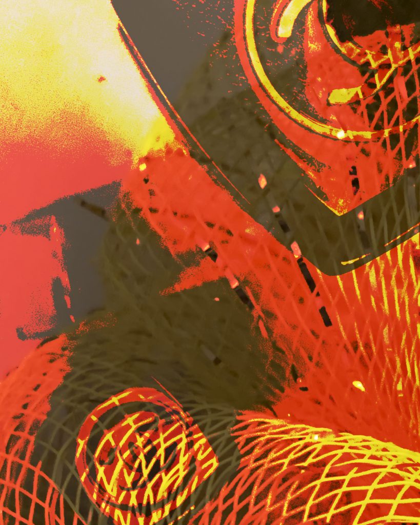
DT#7 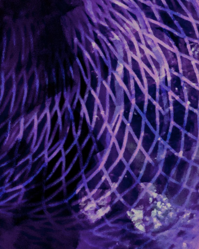
DT#8 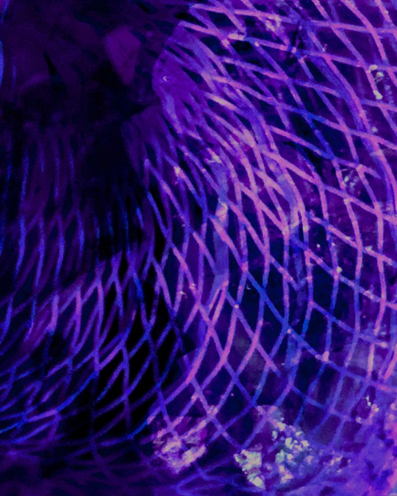
DT#9 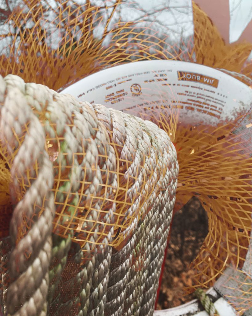
DT#1 update1 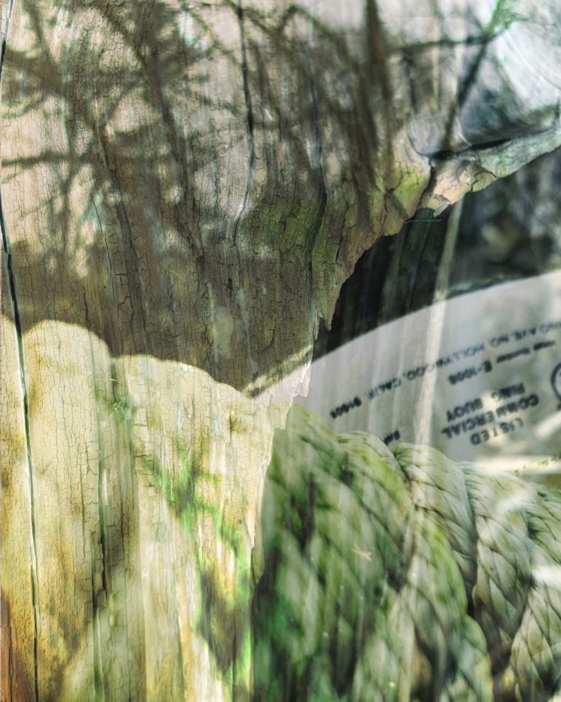
DT#4 update1 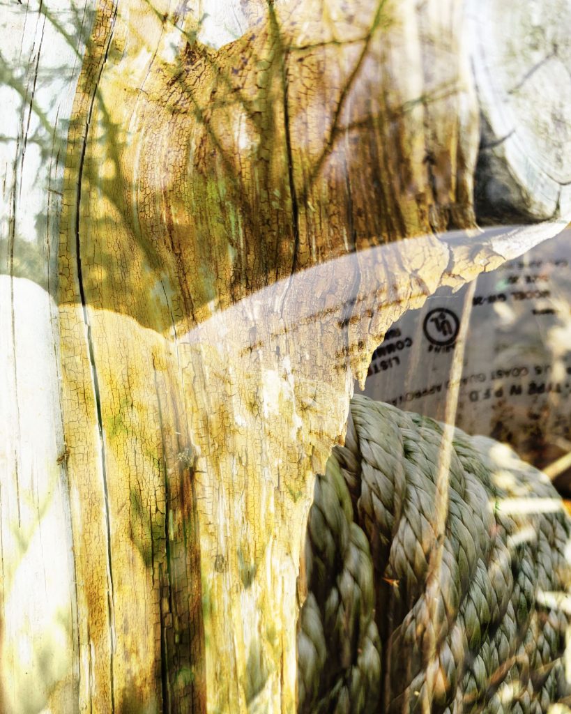
DT#4 update2 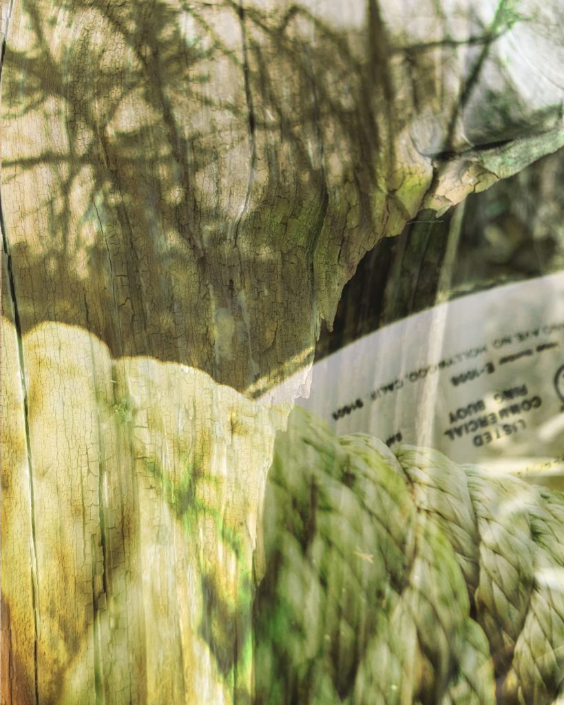
DT#4 update3
DT#4 has the strongest composition, color and contrast. Maybe drop the opacity of make the typographic element more subtle.
The others are pretty muddy and busy. Try adjusting contrast with levels and perhaps explore more options with hue/saturation to unify the color palette.
I agree – DT #4 is the most interesting and I like old-timey feel. I also like DT #1 but I think with more contrast and play with the yellow it would be stronger.
I think that DT#7 resolves best compositionally. Might be interesting ot see it with the contrast amped up as well.
The others are all improved as well.