
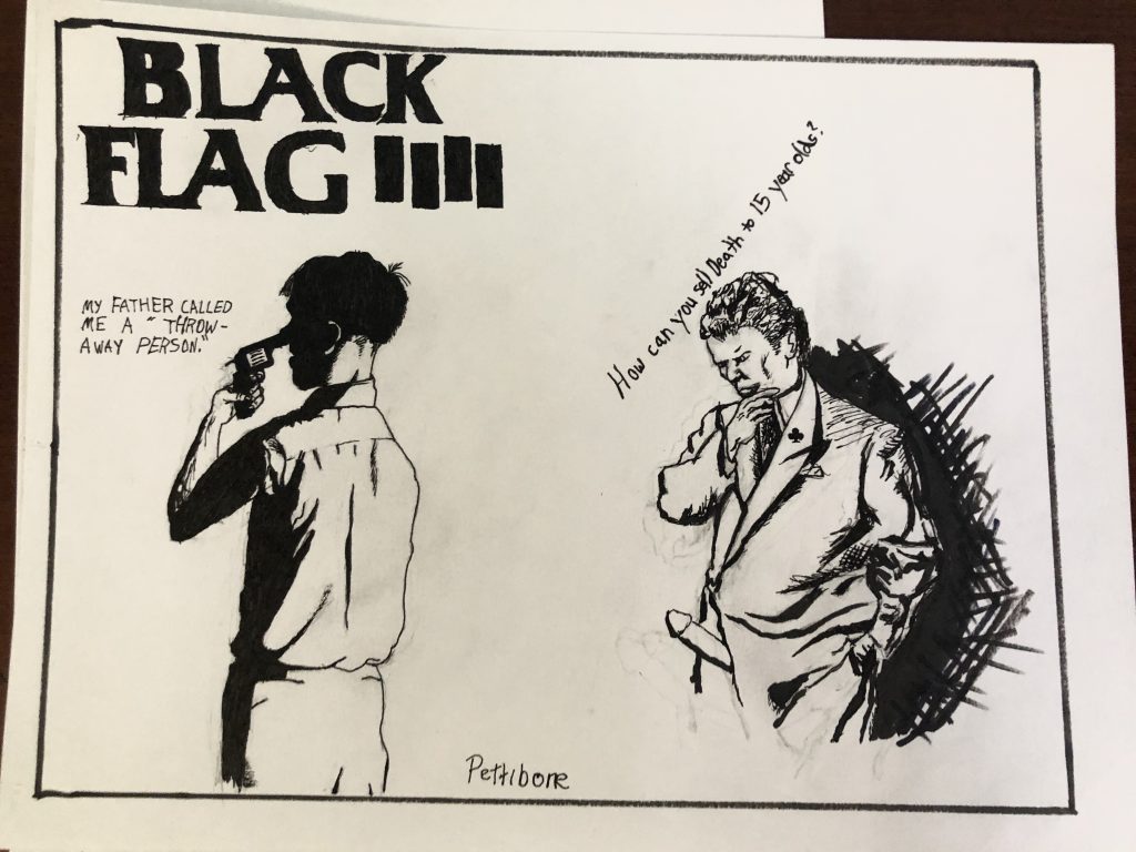
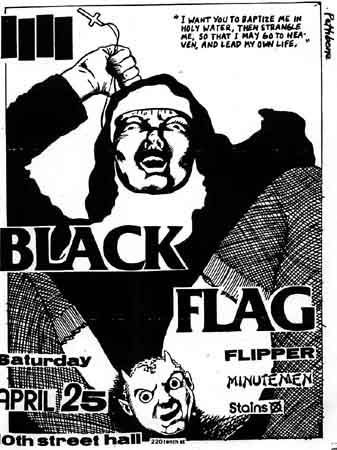
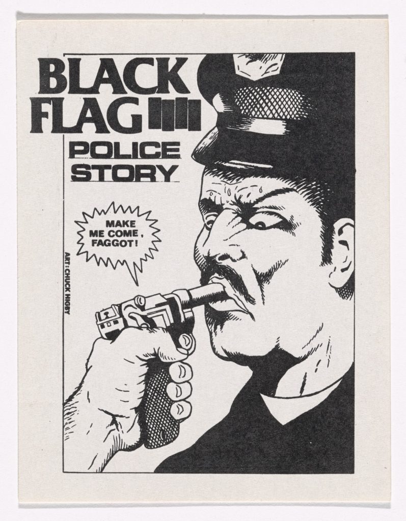
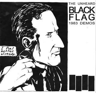
Raymond Pettibon’s style consisted of black and white ink drawings with associating phrases that often, when producing numerous works for his brother’s band “Black Flag,” (Pettibon named and designed Black Flag’s Logo) resulted in very dark satire/ irony. His work also delved into the disturbing territory which I really liked because I share a dark sense of humor with the artist. To me Raymond Pettibon is a genius. Some of his most controversial pieces (designed partly because he knew people would freakout about the taboos he explored) were brilliant in how his art/ sentence based designs created unity and meaning. The first picture is my design utilizing two of the characters from other works of his and I adjusted them and picked out phrases from works of his to create entirely new disturbing meaning for the piece. The 4 of clubs is from the 4 bars (more accurately sails) in the Black Flag logo, and the club is on the right side of the man on the rights jacket. Bottom 3 are examples of some of Raymond Pettibons Punk art mastery from which I based my design on.
A difficult artist to pull off, but I’m glad you enjoyed his work. Your illustrations really capture the essence and angst of his drawings. Well done!