

First upload 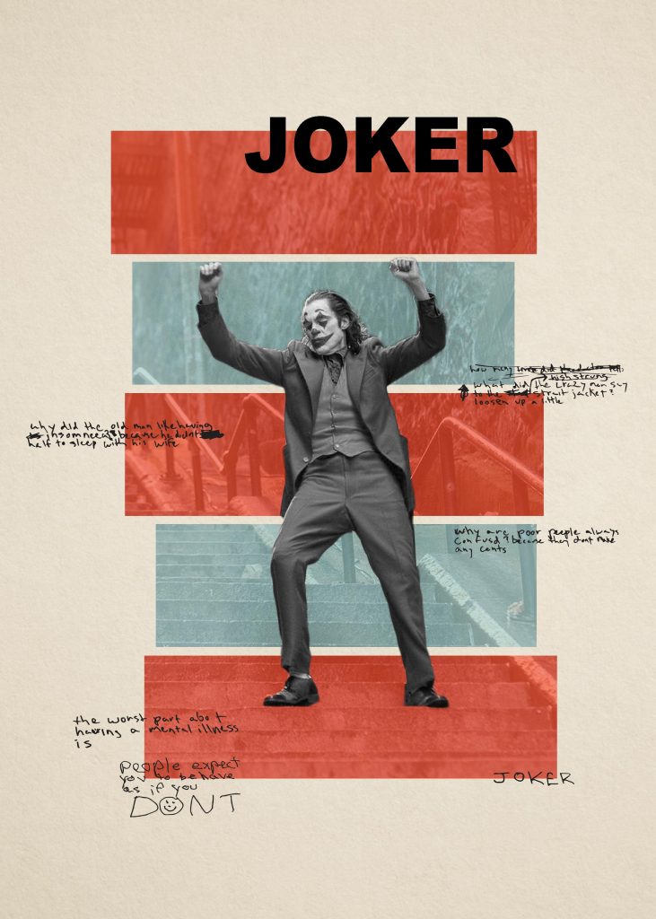
Final
My final submission is more similar to Cristiana’s style. I boosted the saturation of the rectangles to be closer to the colors she uses, updated the spacing a little bit, and put the text on the outside overlapping the boxes since I have noticed that she does that quite a lot. I also chose to add a large, JOKER label to the top in a block font (Impact) which is kind of in the same style as the movie poster and contrasts nicely with the handwritten text. Finally, I made the joker himself black and white since it is a very interesting contrast with the highly saturated boxes. This is common in her work and definitely gives it some added visual interest. I still kind of prefer it in color but the red was a bit too close.
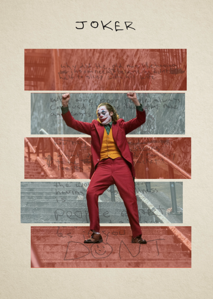
If you’ve seen the movie, you may recognize the text. I was able to pull it from the Joker’s notebook and convert it to vectors with that trace tool in Illustrator so I could make it much larger. I also modified the word “Jokes” to read “Joker” so that I can have the word “Joker” on the card twice as is common with playing cards.
Cristiana Couceiro
There’s really not much information out there about Cristiana. I found one little interview with her where she said she lives in Lisbon, Portugal and does collages for a living. She’s been making collages since she was young, and she’s really developed an interesting style.
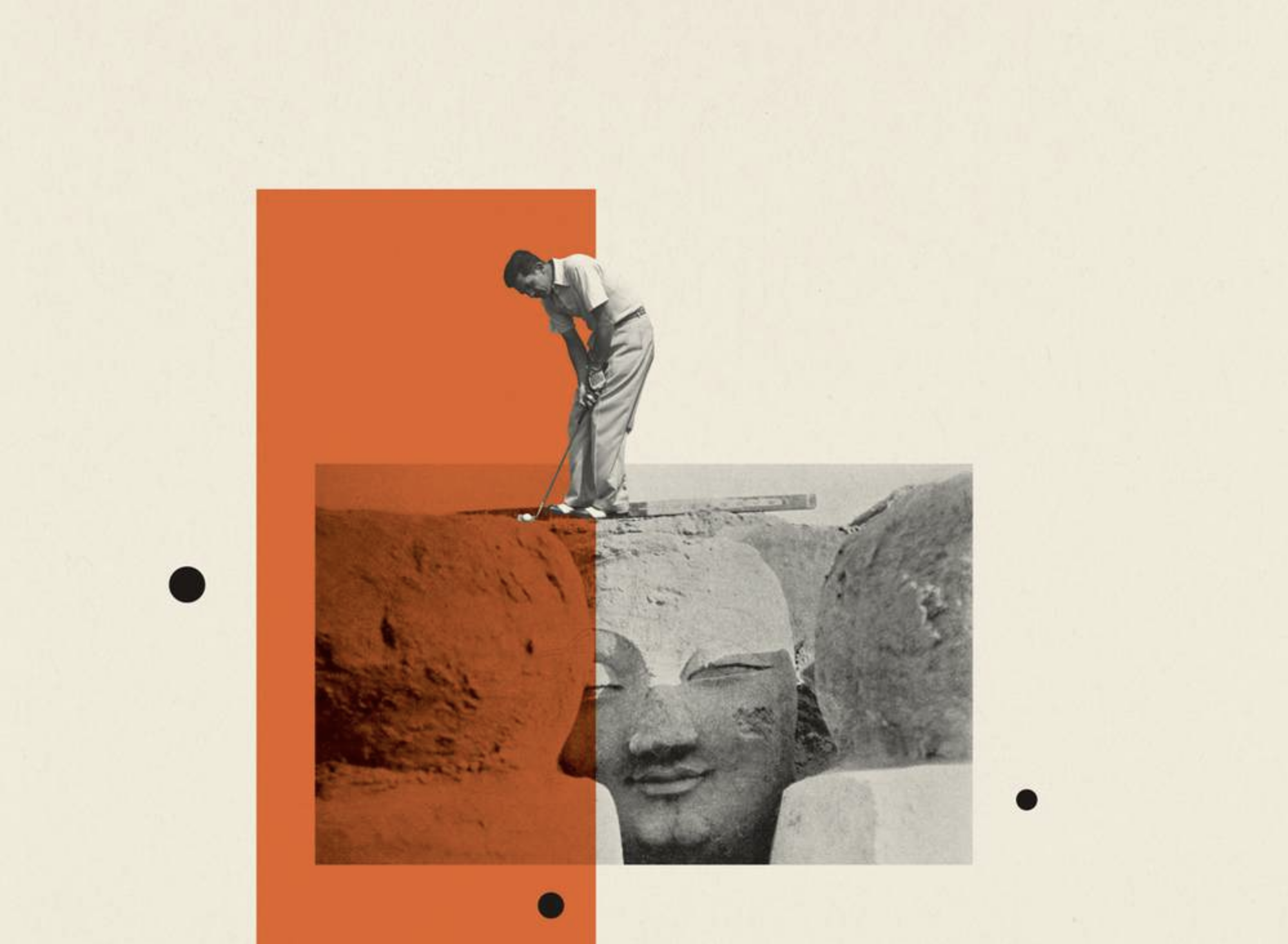
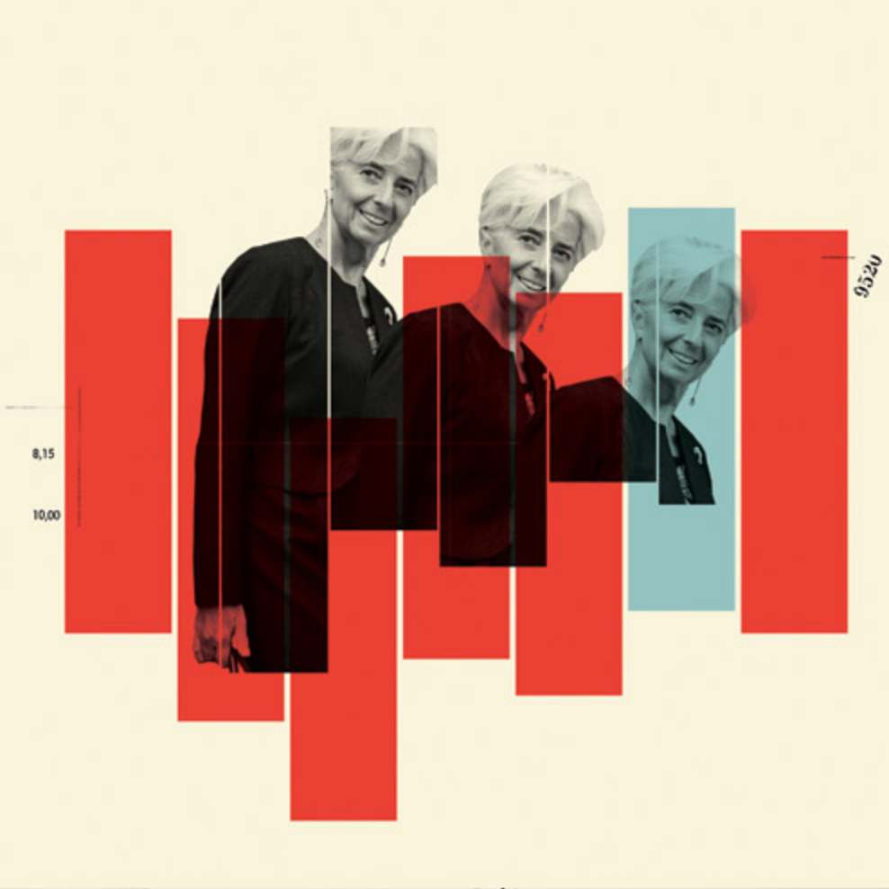
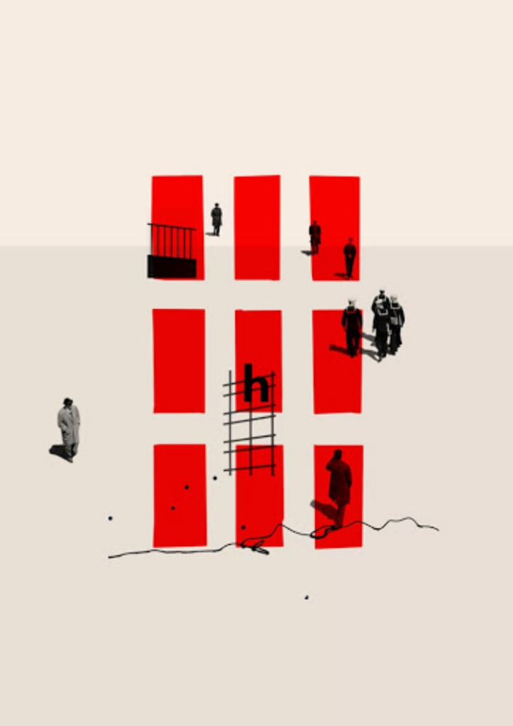
She tends to use a lot of the same colors throughout different works and the backgrounds in particular are quite consistent. I’ve noticed that she likes to use the idea of containment and breaking containment with an interesting mix of photography and geometric shapes.
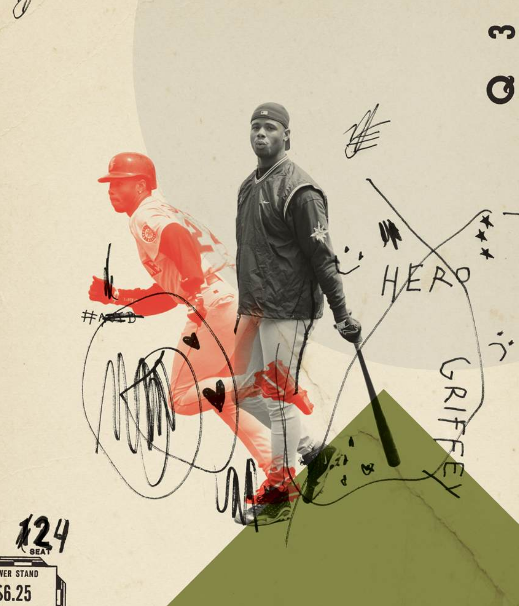
Make sure to post a few pieces by your artist and her name. I think we all know the card…