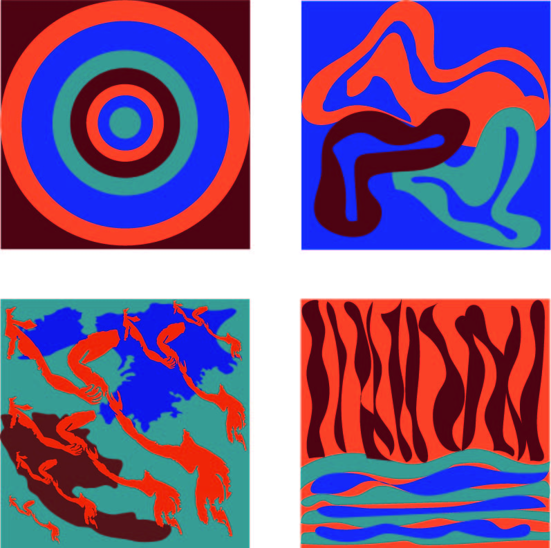
A pretty bold palette that’s hard to resolve with the more chaotic designs. The exception is the bullseye.
If you’re going to stick with this palette, I would follow the success of that piece.
Now that I see that you sampled the colors from Matisse, I would highly recommend looking at his cut paper work. It might be helpful to resolve the compositions.
His cutouts are where I got some inspiration for my composition on the top right! I will work on modifying the bottom two to be less chaotic and more reflective of his style.