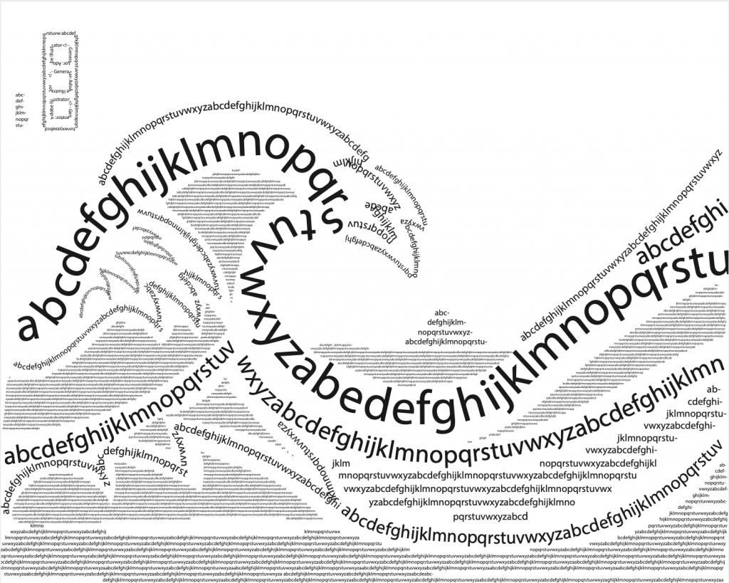
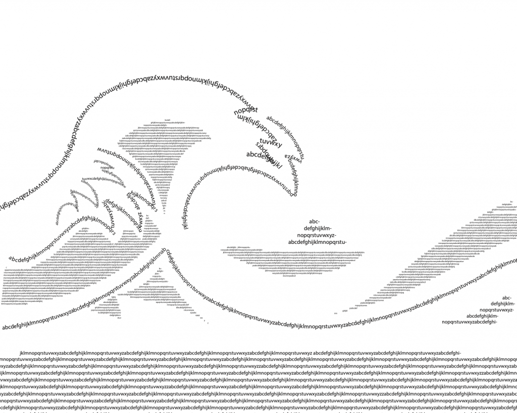
I like the idea of building a landscape out of the letters but I think you have a lot going on. Maybe simplify by keeping less ranges of sizes and play up the big and small ones. Also what is the thing in the top right corner?
I tried to make the inscriptions in the actual piece. I was just looking at the tapestry in my room and thought it was kinda cool and more representational than something I would normally do.
I agree with Phia. The composition can work but you need more sensitivity in the scale variation of the type. I’m inclined to recommend removal of some of the larger type so that the void spaces are left unoccupied. I think the order of the letters is also important to the success and some of the breaks and hyphens feel less considered. The smallest letters are working best so perhaps embrace that style and perhaps try value reductions as well to make it less busy.
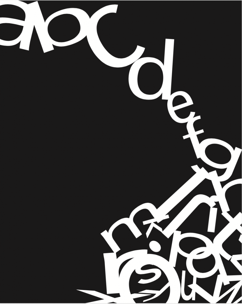
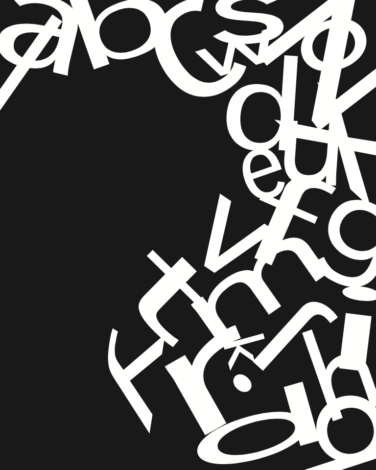
A do like the “less busy” variation.But it kind of reminds me of the Philadelphia Eagles logo!
I like the new direction in the new pieces, but I still think you can refine some of the overlappings to be more consistent and graphically appealing. Focus on the interest of the shapes made between the letters and try to clean up little pointy overlaps and inconsistent gaps.

I like the idea of building a landscape out of the letters but I think you have a lot going on. Maybe simplify by keeping less ranges of sizes and play up the big and small ones. Also what is the thing in the top right corner?
**left corner
I tried to make the inscriptions in the actual piece. I was just looking at the tapestry in my room and thought it was kinda cool and more representational than something I would normally do.
I agree with Phia. The composition can work but you need more sensitivity in the scale variation of the type. I’m inclined to recommend removal of some of the larger type so that the void spaces are left unoccupied. I think the order of the letters is also important to the success and some of the breaks and hyphens feel less considered. The smallest letters are working best so perhaps embrace that style and perhaps try value reductions as well to make it less busy.
A do like the “less busy” variation.But it kind of reminds me of the Philadelphia Eagles logo!
I like the new direction in the new pieces, but I still think you can refine some of the overlappings to be more consistent and graphically appealing. Focus on the interest of the shapes made between the letters and try to clean up little pointy overlaps and inconsistent gaps.