A good start, but very busy and in need of some contrast. I think the 3rd one (CarterTrip) has the most graphic potential but needs some editing. Perhaps try flipping the typography so it functions in a less legible way. And try lots of editing options with levels and hue/saturation.
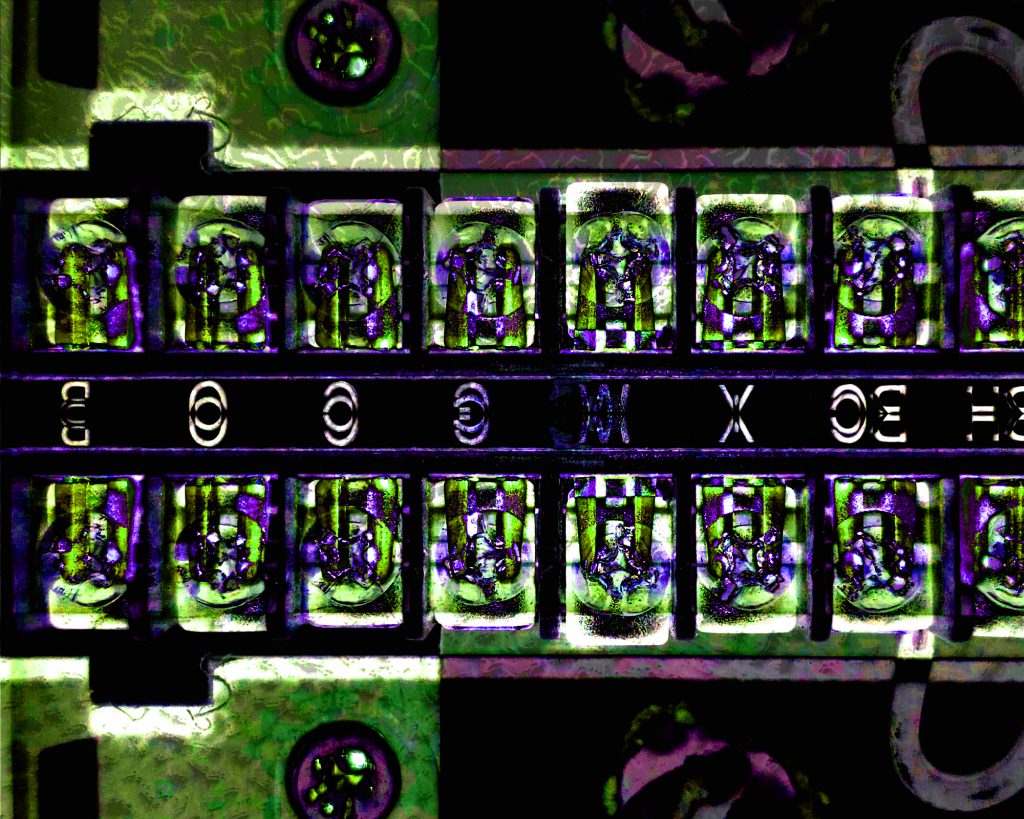
I very much love the color scheme and contrast of the vibrant/fluorescent greens and blues with the blueish black! I agree with Jason though and really want to rotate it too!

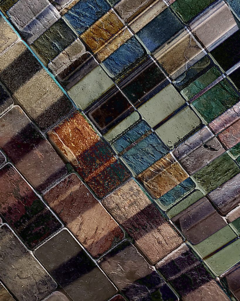
A good start, but very busy and in need of some contrast. I think the 3rd one (CarterTrip) has the most graphic potential but needs some editing. Perhaps try flipping the typography so it functions in a less legible way. And try lots of editing options with levels and hue/saturation.
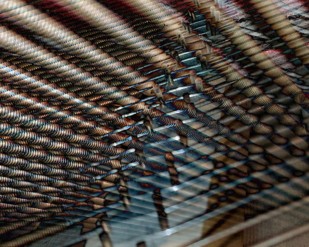
Just checking to see if one of these is your final submission.
Sorry, forgot to post the final one before
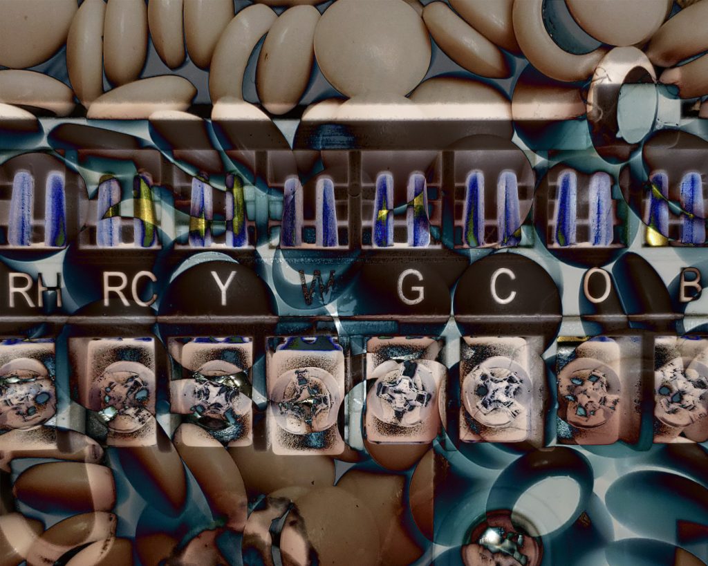
Thanks. Good job resolving the color and contrast. I really want to rotate this counterclockwise for better balance!
I very much love the color scheme and contrast of the vibrant/fluorescent greens and blues with the blueish black! I agree with Jason though and really want to rotate it too!